
Sponsored Link


Sponsored Link
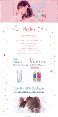
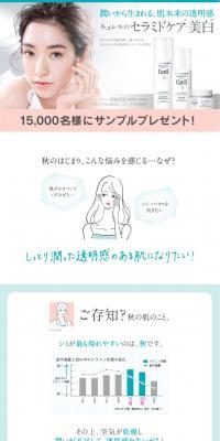
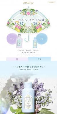
Sponsored Link
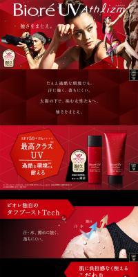
Sponsored Link
Sponsored Link
Sponsored Link
Sponsored Link
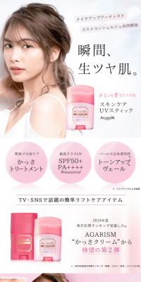
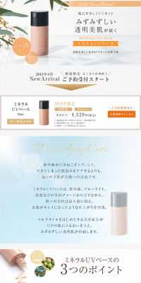
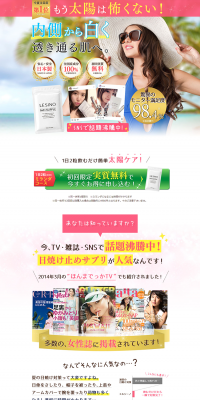
Sponsored Link
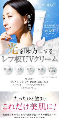
Sponsored Link
Sponsored Link
LP (Landing Page) Design Reference List
Daily updates of LP (Landing Page) design examples categorized by industry and style.
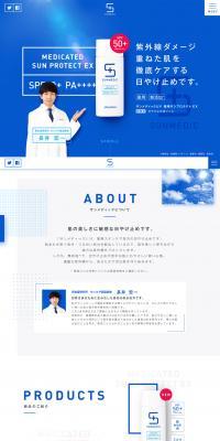
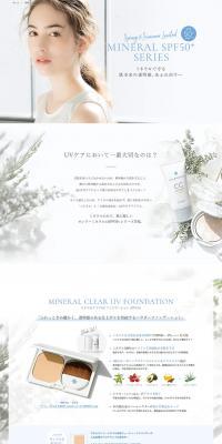
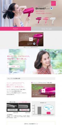
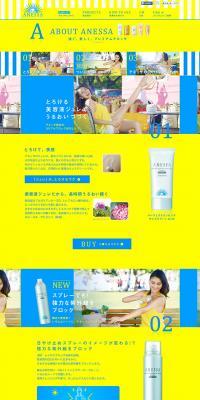
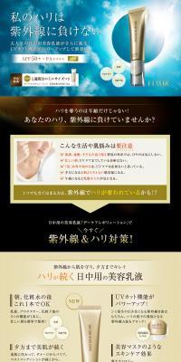
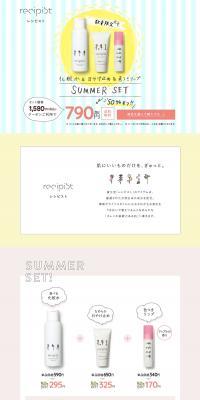
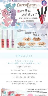
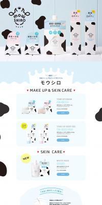
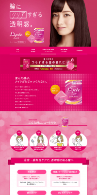
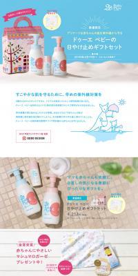
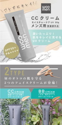
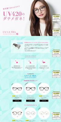
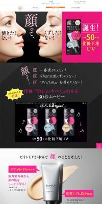
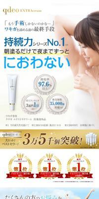
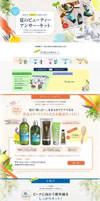
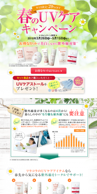
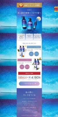
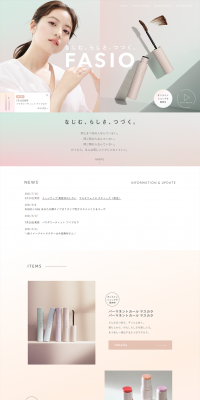
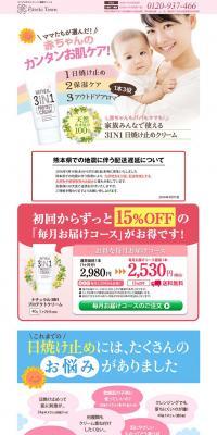
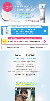
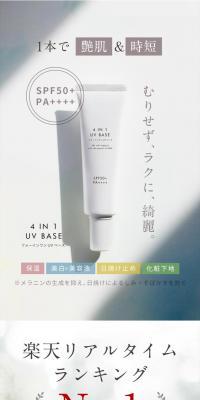
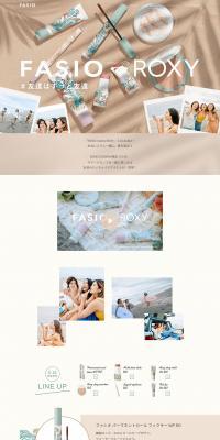
This guide clearly explains, based on example trends, the design points, color usage, and messaging structure for UV care landing pages—from everyday sun protection to outdoor products and inner care. It also introduces color palette patterns that can be immediately applied to your design direction.

Creating a UV care LP starts with understanding the target audience and usage scenarios. Place visuals in the first view that convey the main benefits and a sense of trust, and use texture shots and lifestyle photos to help users imagine the product feel. Highlight ingredients and features with icons and headings, and organize content into readable columns. Emphasize a mobile-first layout, clear CTAs, image optimization, and load-speed management. For color tone, aim for cleanliness and freshness: consider white and beige for skincare, and blue and yellow accents for outdoor products.
When producing the LP, avoid exaggerated efficacy claims and present precautions and allergy information in a clearly visible way. Supplement before-and-after photos with shooting and captions that don't appear exaggerated, and choose photos that consider a variety of skin types. Consider color contrast and font size for readability and accessibility, and position CTAs so they don't get lost. Compress and lazy-load high-resolution images appropriately to avoid undermining the page's trustworthiness and usability.
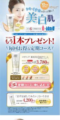
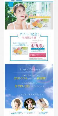
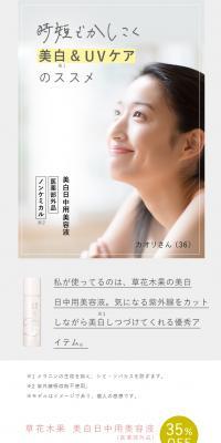
Motif: Sophisticated skincare image
Color scheme: White×Beige×Navy blue
A combination that highlights the skin's cleanliness. Use white widely for the background, add warmth with beige, and use navy to add a sense of trust and to tighten up ingredient explanations and CTAs. Photos of textured creams or close-ups of skin work well.
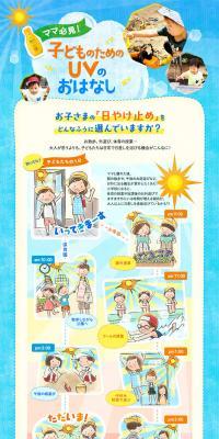
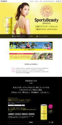
Motif: Active outdoor scene
Color scheme: Yellow×Orange×Navy blue
A palette that evokes use under the sun. Use yellow to convey brightness, orange to express activity, and navy to maintain readability. It pairs well with visuals for outdoor and sports products and works as an accent for buttons and emphasis elements.
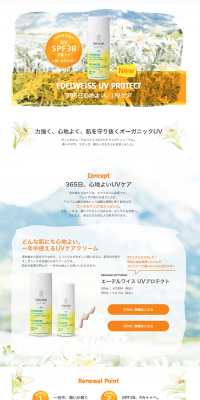
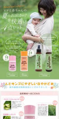
Motif: Natural botanical expression
Color scheme: Green×Beige×Brown
A suitable palette for promoting plant-derived or low-irritation products. Use soft green as a base, add warmth with beige, and calm labels and subheadings with brown to create a natural sense of trust. It pairs well with natural-style packaging and bottle photos.
Sponsored Link
Sponsored Link
Sponsored Link
Sponsored Link
Sponsored Link
Sponsored Link
Sponsored Link
Sponsored Link
Sponsored Link
Sponsored Link

Check the list of catch phrases
You can check a list of the main catchphrases used on the landing page of the currently displayed design list, and use it as a reference when creating your own catchphrase.
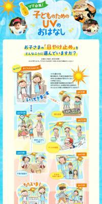










What is UV care?
UV care refers to all measures to protect the skin, hair, and eyes from ultraviolet rays and to reduce damage such as sunburn, photoaging, and pigmentation. A wide range of products fall under UV care, from makeup primers and sunscreens to body lotions, hats and apparel, inner care, and supplements. On UV care landing pages, it is common to promote products in categories such as skincare, body care, cosmetics, fashion, health foods, and sporting goods; organizing information and designing visuals according to the product's intended use, season, and texture/feel is important.