
Sponsored Link


Sponsored Link
Sponsored Link
Sponsored Link
Sponsored Link
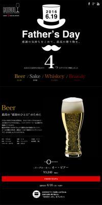
![Doppo Beer, Mabi Chikurin Bakushu, and more! Cheers with recommended local beers from Okayama! [My Fava] LP design (Travel & Outdoor / yellow / Cute style) PC version](https://rdlp.jp/image/lp-archive/31477/200x400.jpg)
Sponsored Link
Sponsored Link
Sponsored Link
Sponsored Link
Sponsored Link
LP (Landing Page) Design Reference List
Daily updates of LP (Landing Page) design examples categorized by industry and style.
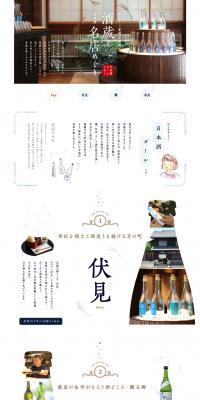
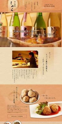
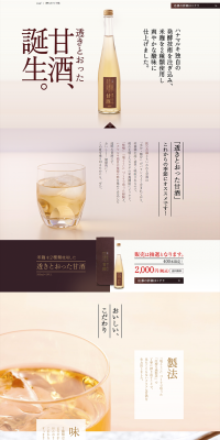
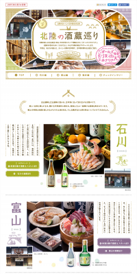
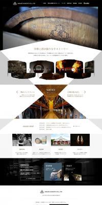
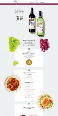
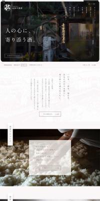
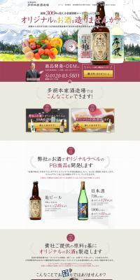
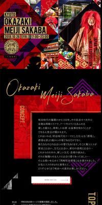
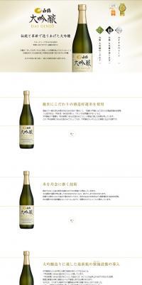
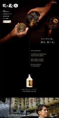
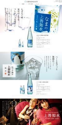
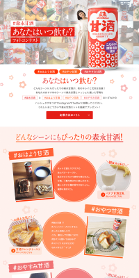
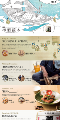
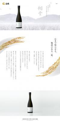
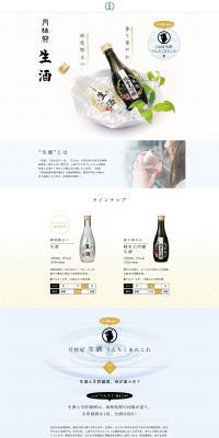
For LP designs with a sake theme, it is important to express 'tradition,' 'quality,' and 'a sense of the seasons.' Users are attracted not only to the taste but also to the history, brewing methods, and regional characteristics of the sake brewery, so a design that emphasizes storytelling is effective. Incorporating Japanese paper (washi) or brushstroke-style fonts into the background can create a Japanese atmosphere, and including sake vessels and food pairings in product photos enhances realism. This summary page collects examples of sake-themed LP designs and introduces strategies to enhance branding and purchase intent.

When creating sake LP designs, the key is how to express 'tradition and high quality.' A calm design with a washi-style background or based on sumi (ink) colors can emphasize history and culture. Also, making the bottle label prominent can better convey the brewery's dedication. Furthermore, by suggesting food pairings and seasonal ways to enjoy sake, it is possible to make users think they 'want to incorporate it into their own lives.' For LPs targeting overseas audiences, visually emphasizing Japanese motifs and cultural elements is effective.
For sake LP designs, it is important to avoid overly flashy presentations and focus on a calm atmosphere. Even when appealing to tradition, it is good to incorporate modern elements appropriately so as not to feel outdated. Also, as an alcoholic product, it is appropriate to avoid expressions that promote excessive drinking and instead suggest moderate consumption and ways to enjoy it. Furthermore, when considering international users, designs that convey Japanese sensibility while being mindful of accessibility, such as English notation, are effective.
Recommended motifs and color schemes
For sake LP designs, motifs such as washi paper, brushstrokes, masu (wooden sake cups), tokkuri (sake flasks), and seasonal elements like cherry blossoms and autumn leaves are suitable. The color scheme should primarily consist of calm, Japanese-inspired tones, with additional colors chosen to convey luxury and a sense of the seasons.
A color scheme that expresses traditional and high-quality sake.
A color scheme suitable for festive and celebratory occasions.
A calm color scheme in harmony with nature.
Sponsored Link
Sponsored Link
Sponsored Link
Sponsored Link
Sponsored Link
Sponsored Link
Sponsored Link
Sponsored Link
Sponsored Link
Sponsored Link

Check the list of catch phrases
You can check a list of the main catchphrases used on the landing page of the currently displayed design list, and use it as a reference when creating your own catchphrase.









What is Sake?
Sake is a traditional Japanese alcoholic beverage made by fermenting rice, rice koji, and water as main ingredients. There are various types such as Junmai-shu, Honjozo-shu, and Daiginjo-shu, and their flavors and aromas differ greatly depending on the rice polishing ratio and brewing process. A distinctive feature is that the way it is enjoyed changes with temperature (chilled, room temperature, hot), and its versatility with food is also appealing. In recent years, it has attracted attention both domestically and internationally, gaining popularity as gifts and souvenirs in tourist destinations. Sake holds value as a 'special beverage to be enjoyed with culture.'