Sponsored Link


Sponsored Link
Sponsored Link


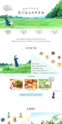
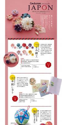
Sponsored Link
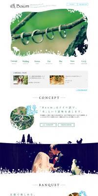
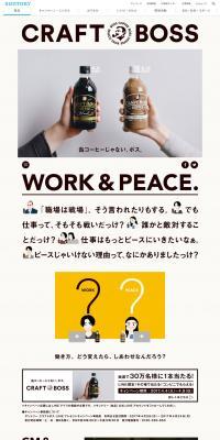
Sponsored Link
Sponsored Link
Sponsored Link
![[Seasonal Coffee] Iced Coffee LP design (Beverages and Alcohol / Beige tones / Arts) PC version](https://rdlp.jp/image/lp-archive/21214/200x400.jpg)
Sponsored Link
Sponsored Link
Sponsored Link
LP (Landing Page) Design Reference List
Daily updates of LP (Landing Page) design examples categorized by industry and style.
Landing pages themed "stylish" create an impression through the harmony of color, spacing, photography, and typography. This page introduces practical approaches and color palette examples useful in real-world work.

Begin production with research: organize the target's preferences and competitors' visual tendencies. Use a mood board to fix colors and textures and decide base, accent, and text colors. Create typographic hierarchy between headings and body text, and unify photography toward either lifestyle or product focus. Take ample white space in the layout and design sightlines with a grid. Make CTAs distinguishable from their surroundings while blending with the overall tone. Also consider responsiveness, load speed, readability, and accessibility simultaneously for practical results.
Adding too much decoration can make a design look cluttered or hard to read. Lack of contrast or too-small text harms readability, so be careful. Blindly using trendy fonts or effects can undermine brand consistency. Avoid color choices without regard to cultural meanings or color-blind users, differences in image quality, slow page loading, and misleading expressions. In the end, prioritize achieving both visual beauty and clarity of information.
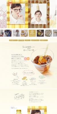
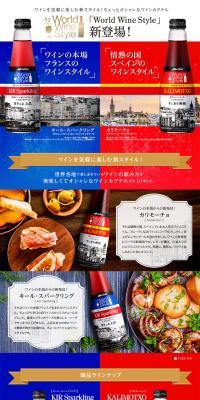
Motif: A lifestyle with modern interiors and coffee
Color scheme: Beige × Brown × Gold
Using warm beige as a base with deep brown accents gives a calm, luxurious feel. Introducing gold-like textures in icons or accents helps balance homeliness and refinement.
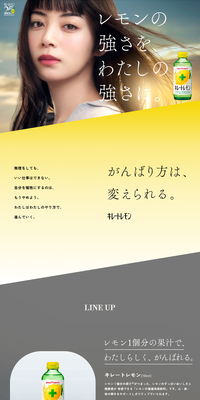
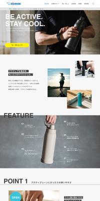
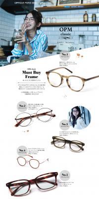
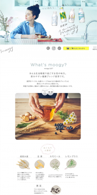
Motif: Visuals of refreshing drinks and sunglasses
Color scheme: White × Blue × Black
Using white as the base with a clean blue as an accent emphasizes freshness. Use dark text close to black for readability, and unify photos in a brighter tone to achieve both cleanliness and refinement.
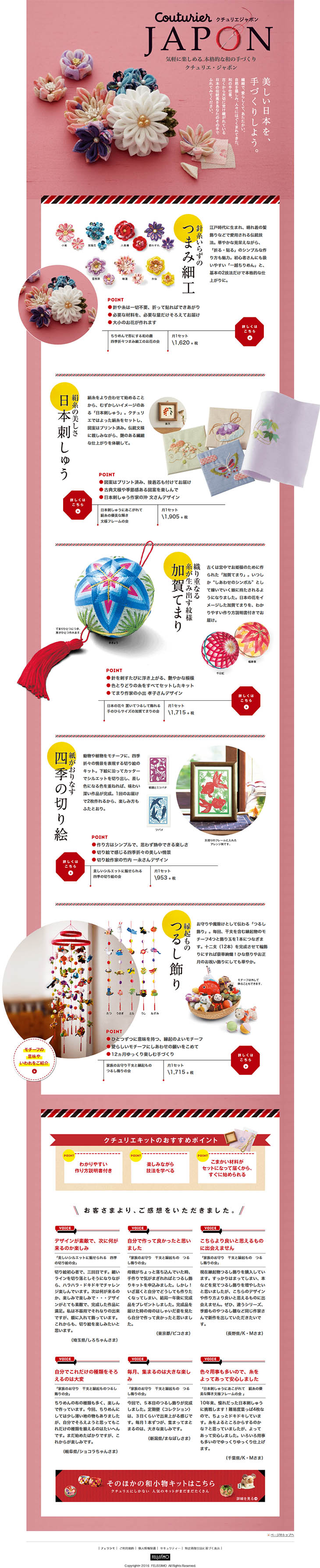
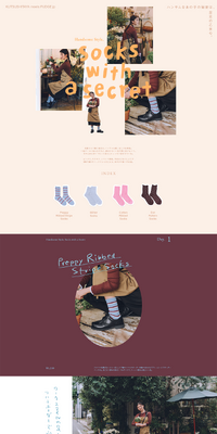
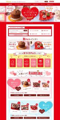
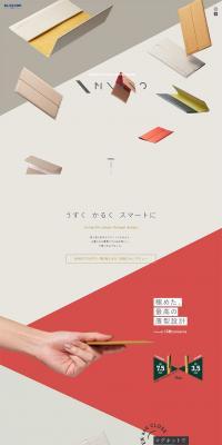
Motif: Natural goods and fashion accessories
Color scheme: Pink × Beige × Brown
A palette that uses soft pink as the base tempered with beige and tightened with brown for text and frames balances cuteness with natural warmth. It pairs well with photos that emphasize material texture.
Sponsored Link
Sponsored Link
Sponsored Link
Sponsored Link
Sponsored Link
Sponsored Link
Sponsored Link
Sponsored Link
Sponsored Link
Sponsored Link

Check the list of catch phrases
You can check a list of the main catchphrases used on the landing page of the currently displayed design list, and use it as a reference when creating your own catchphrase.









What is 'stylish'?
Being 'stylish' isn't simply following trends; it's creating an impression suited to the purpose by keeping color, spacing, material texture, photography, and typography consistent. In this field, common tendencies across industries—such as beverages, fashion, coffee, interiors and everyday goods, services and food, and eyewear—use tones like white, beige, blue, black, and pink, combining tastes such as simple, natural, and clean. What's important is balancing the visual 'character' with readability and trust. Details like color contrast, use of white space, photo tone, and font choices determine the impression.