LP design by Morinaga Seika in Toreeningu Rabo
View PC page
View SP page

LP design by Morinaga Seika in Toreeningu RaboLP information
- Registration date 2026-06-25
- https://www.morinaga.co.jp/in/support/labo/2026new/
- Product/service name
- Morinaga Seika in Toreeningu Rabo
- Categories
- General Sports and Spectating
- Company name
- Morinaga Seika Kabushiki Kaisha(Tokyo-to Minato-ku)
- Color
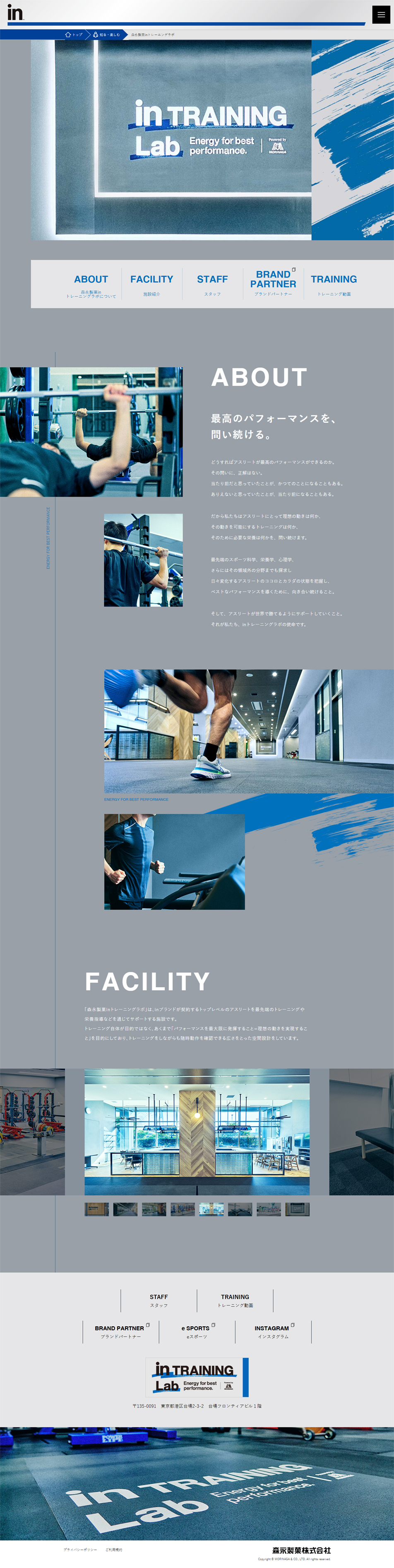
- We design LPs using Shades of grey
- Image
- These LPs have a "Simple" style design
- Catchcopy
- intraininglab
- Design
- A refined, stylish aesthetic that conveys an athletic feel: it is limited to three colors—gray, white, and the vivid blue that is the brand color of in zerii—giving a cool and professional impression. Brand consistency: the blue "brush stroke" (brush touch) graphics placed throughout the page express dynamism and energy, enhancing the feel of a sports brand.????High visibility and use of layout white space: generous spacing between text and images and between sections gives a refined, luxurious feel without clutter. Use of fonts: bold, heavy English fonts (e.g., FACILITY, ABOUT) are used prominently for headings, while Japanese text uses a thin, easy-to-read gothic typeface, creating a modern and minimal impression.????Eye-catching visuals and dynamic photos: photos with a sense of motion—such as muscle movement or the feet during training—are effectively cropped and placed, intuitively conveying the facility's commitment. Slider function: the "FACILITY (facility)" section has a horizontally arranged gallery that cleverly shows the real scenes in a compact and smart way.
in zeriiin baaMorinaga Seika Kabushiki Kaishahealthnutritional supplementsMorinaga Seika in Toreeningu Rabosupport athletesUiidaaproteintraining labMorinaga
【Note】 The landing page shown above was not designed by our company.
※You can view our production portfoliohere.
Clicking the design opens the source website.
*The original site may have been modified or removed.