LP design by Futsukayoi Chiryouyaku AO
View PC page
View SP page

LP design by Futsukayoi Chiryouyaku AOLP information
- Registration date 2026-07-07
- https://ouchide.clinic/lp/ao/001
- Product/service name
- Futsukayoi Chiryouyaku AO
- Categories
- Health foods, health drinks, and supplements
- Company name
- Medvice Kabushiki Kaisha(Tokyo-to Taito-ku)
- Color
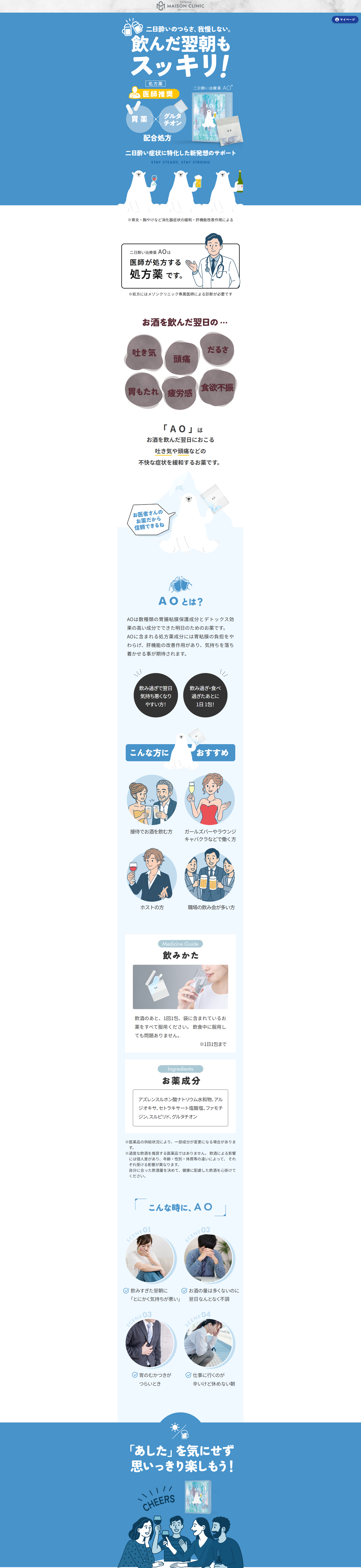
- We design LPs using Shades of blue
- Image
- These LPs have a "Cute style" style design
- Catchcopy
- Don't endure the pain of a hangover. Feel refreshed even the morning after drinking!
- Design
- 1. Color design of "medical × beauty" that emphasizes cleanliness and trustworthiness
Selection of main colors
To balance medical trustworthiness and the sophistication of beauty, white is used as the base, with pale blue, mint green, or gentle pinks and beiges often used as accents. Excessive flashiness is restrained to ensure a clean impression.
Fonts and layout
Clean, easy-to-read gothic (sans-serif) typefaces or stylish mincho (serif) typefaces are used; even for medical information that tends to be text-heavy, generous use of white space creates a refined layout without a sense of crowding.
2. Illustrations and photos that visualize the "ease of completing everything at home"
Friendly visuals
As the concept 'ouchide (at home)' indicates, photos of a woman (or man) relaxing at home holding a smartphone, or soft-touch illustrations, are often placed in the first view (top of the page).
Infographics for "no clinic visits required"
A sequence such as "consultation by smartphone", "fastest same-day shipping", "delivered to your mailbox" is visually explained using icons and simple step diagrams (1,2,3...), creating a UI/UX that makes users feel "I could do this too."
3. Information design to relieve anxiety (compliance and reassurance)
Design that shows the faces of doctors and clinics
Because online prescriptions are not face-to-face services, photos and profiles of partner doctors and proper medical institution notations are firmly incorporated into the design.
Clarity of pricing and compliance
Pricing structures such as "consultation fee XX yen" and "medicine fee from XX yen" are laid out clearly in neat tables. Additionally, text design consciously avoids exaggerated expressions and complies with medical advertising guidelines.
4. Smooth conversion (CTA) design
Navigation design that avoids confusion
Conversion buttons such as "Book now on your smartphone" and "Easy consultation via LINE" are often fixed (sticky) at the bottom of the screen, preventing user drop-off by allowing one-tap progression to the next action whenever the user decides to proceed.
【Note】 The landing page shown above was not designed by our company.
※You can view our production portfoliohere.
Clicking the design opens the source website.
*The original site may have been modified or removed.