
LP design by
View PC page
View SP page

LP design by LP information
- Registration date 2026-09-16
- https://www.akagi.com/brand/florida-sundae/2026new/autumn-design
- Product/service name
- フロリダサンデー
- Categories
- ice
- Company name
- 赤城乳業株式会社(埼玉県深谷市)
- Color
- We design LPs using Purples
- Image
- These LPs have a "Simple" style design
- Catchcopy
- こだわりソースで最後まで!フロリダサンデー
- Design
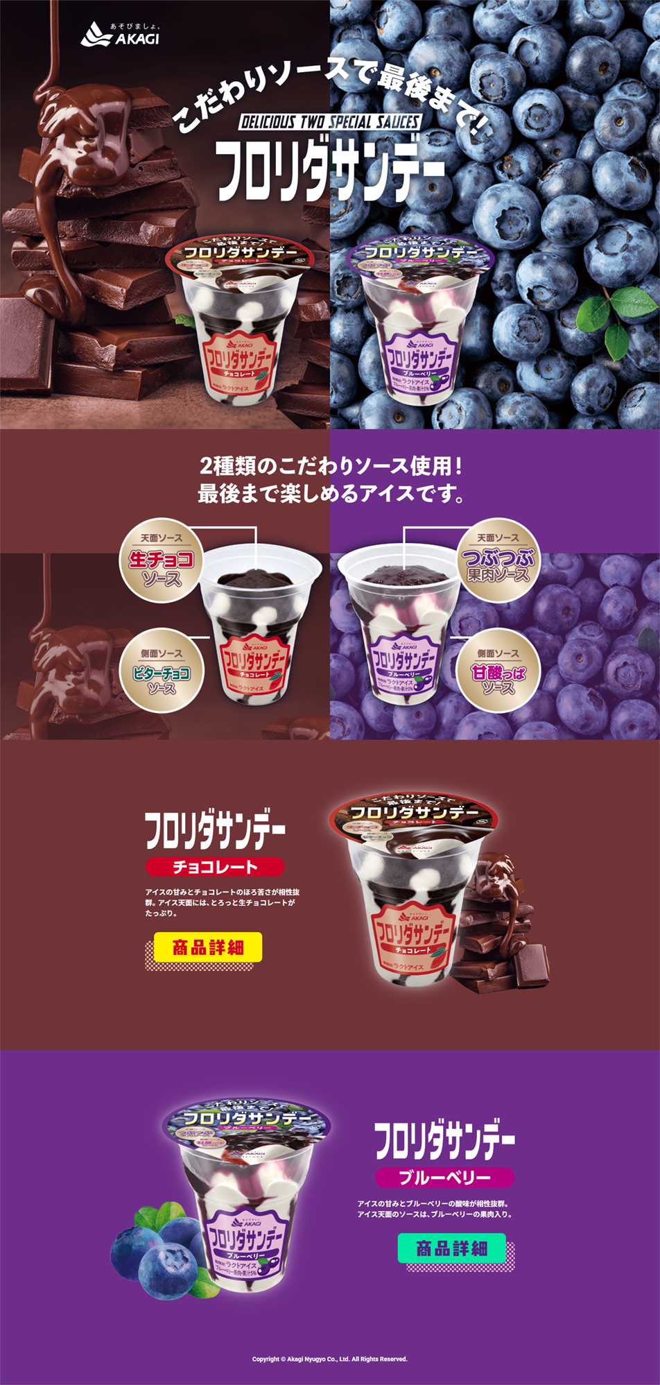
- シズル感を強調した大胆なビジュアル画面最上部に、とろけるチョコレートやみずみずしいブルーベリーの実物写真を大きく配置しています。あえてアイス単体だけでなく、素材そのものの美味しそうなビジュアル(シズル感)を前面に出すことで、直感的に「濃厚で美味しそう」と感じさせる仕掛けです。フレーバーごとの明確な色分け(カラーゾーニング)チョコレートは「深みのあるブラウン」、ブルーベリーは「鮮やかなパープル」と、商品のイメージカラーで画面が真っ二つに分割されています。これにより、直感的に2つのフレーバーがあることが伝わり、視線が迷いません。商品の「こだわり構造」を伝える図解中央部分では、商品パッケージを半透明(または断面図のよう)に見せ、天面と側面の「2種類のソース」の位置をイラストと文字で解説しています。「最後までソースを楽しめる」という商品の最大の強みが、テキストを読み込まなくても一目で理解できる構成です。レトロポップなロゴとフォント使い1980年代のヒット商品を現代に復刻した背景があるため、商品ロゴにはどこか懐かしさを感じるカタチの太いフォント(レトロポップ)が使われています。背景のグラデーションや、丸い吹き出しのデザインも、ポップで親しみやすい印象を与えています。全体として、スマートでスタイリッシュなデザインというよりも、「とにかく美味しそう」「贅沢感がある」というメッセージがストレートに伝わる力強いデザインになっています。
【Note】 The landing page shown above was not designed by our company.
※You can view our production portfoliohere.
Clicking the design opens the source website.
*The original site may have been modified or removed.











