
LP design by Garigari-kun: Let's cool off.
View PC page
View SP page
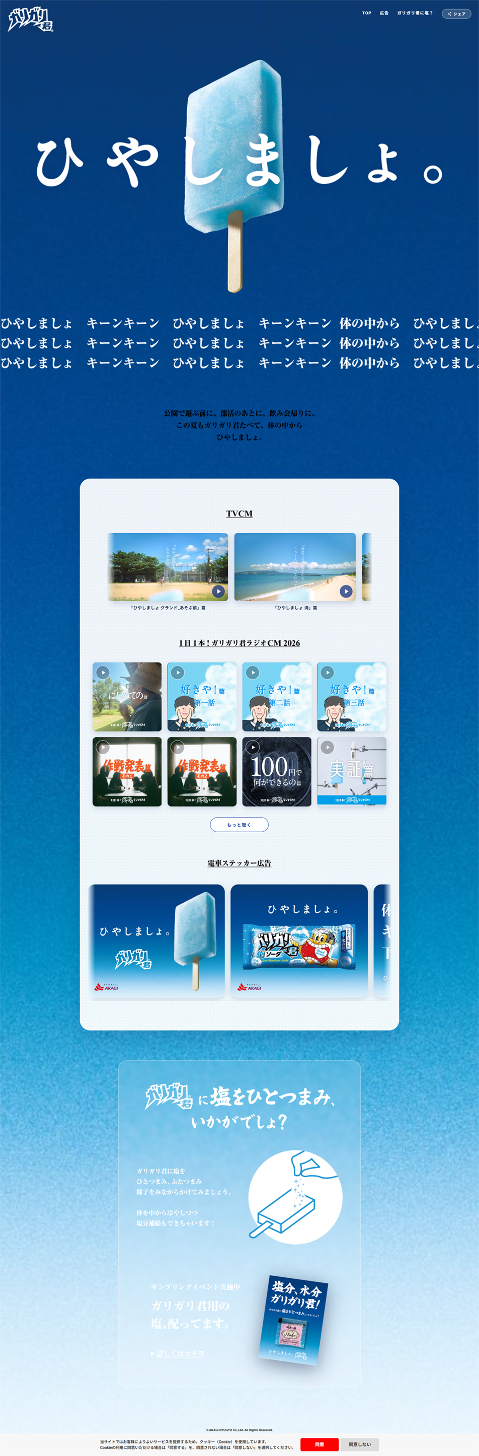

LP design by Garigari-kun: Let's cool off.LP information
- Registration date 2026-09-16
- https://www.akagi.com/gari-hiyashimasho/
- Product/service name
- Garigari-kun: Let's cool off.
- Categories
- ice
- Company name
- Akagi Nyugyo Kabushiki Kaisha(Saitama-ken Fukaya-shi)
- Color
- We design smartphone LPs using Shades of blue
- Image
- These smartphone LPs have a "Simple" style design
- Catchcopy
- Let's cool off.
- Design
- 1. Color scheme: unified Garigari-kun blue
Brand color continuity: The familiar "soda-flavored blue" associated with Garigari-kun packaging is used throughout, from the background color to the gradients. White and light blue accents: Only "white" and "light blue" are used for text, content backgrounds, and illustrations. By thoroughly eliminating unnecessary colors, the design intuitively conveys a sense of "coldness" and "refreshing coolness" to viewers.
2. Layout: tall composition that makes use of negative space
Bold first view: The moment the page opens, what catches the eye is a single ice pop (Garigari-kun) floating against a blue background and the large headline "Let's cool off." Without cramming information in, generous negative space (evoking a blue sky or the deep sea) is created to emphasize the feeling of freshness. Regular card-style arrangement: The CM videos and ad gallery are neatly aligned in a grid inside rounded white boxes. This gives a clean impression and is designed to be easy to view while scrolling on smartphone screens.
3. Typography: friendly, handwritten feel
Handwritten-style warmth: The main copy for "Let's cool off." uses a slightly informal, warm, handwritten-style font. This removes corporate stiffness and evokes a friendly, nostalgic summer-vacation atmosphere. Background text pattern: Below the hero area, the phrase "hiyashimasho kiin-kiin tai no naka kara hiyashimasho" is repeated like a wave or wind pattern, functioning as a decorative design accent.
4. Graphics: simple, intuitive illustrations
Pictogram-like explanatory illustrations: In the lower part of the page introducing "a pinch of salt," simple line-drawn illustrations are used instead of realistic photos. They are drawn in white lines that blend into the blue background, conveying information clearly without breaking the overall refined tone and manner. Across the entire design, effort has been made to present the familiar product Garigari-kun as an attractive, simple, cool presence that blows away the summer heat.
【Note】 The landing page shown above was not designed by our company.
※You can view our production portfoliohere.
Clicking the design opens the source website.
*The original site may have been modified or removed.











