
LP design by Furorida Sandee
View PC page
View SP page

LP design by Furorida SandeeLP information
- Registration date 2026-09-08
- https://www.akagi.com/brand/florida-sundae/2026new/
- Product/service name
- Furorida Sandee
- Categories
- ice
- Company name
- Akagi Nyugyo Kabushiki-gaisha(Saitama-ken Fukaya-shi)
- Color
- We design LPs using Beige tones
- Image
- These LPs have a "Lively type" style design
- Catchcopy
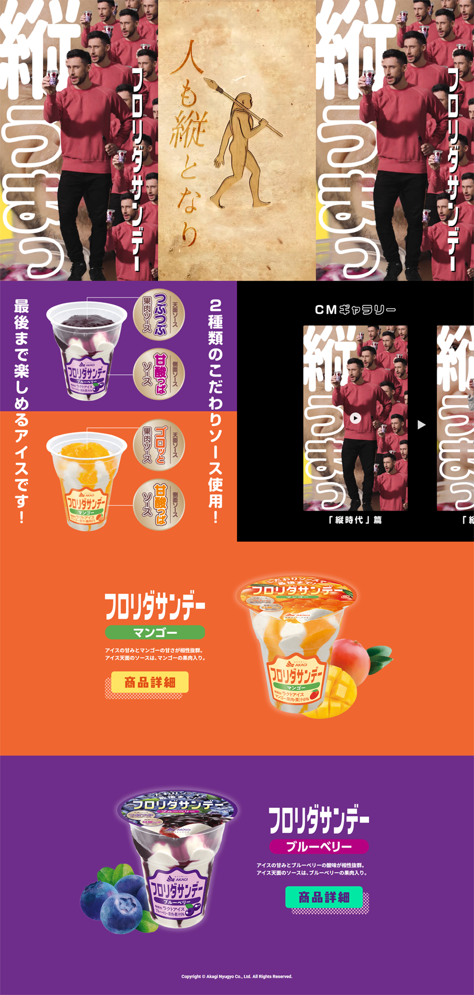
- Vertically tasty Furorida Sandee
- Design
- 1. A layout specialized for vertical (smartphone) screens. The site centers on vertical videos optimized for modern smartphone viewing. As the catchphrases 'people turn vertical' and 'vertically tasty' indicate, text is arranged dynamically in vertical orientation, creating a composition that fills the smartphone screen with impact.
2. Visualizing the product's 'vertical sauce structure' The main feature of this ice cream is that the sauce flows beautifully not only on the top but also along the vertical sides of the cup. In the center of the site, we present that structure clearly with a cross-sectional illustration of the cup and graphics that highlight the care taken with the sauce.
3. Vivid two-color contrast per flavor We use a bold, vertically separated color scheme with mango's vivid orange and blueberry's deep purple stacked top and bottom. By intentionally dividing the background into strong single colors, each product's fruitiness and colorfulness stand out at a glance, resulting in a pop and highly legible design.
【Note】 The landing page shown above was not designed by our company.
※You can view our production portfoliohere.
Clicking the design opens the source website.
*The original site may have been modified or removed.











