
LP design by Serufu Kurasshu
View PC page
View SP page

LP design by Serufu KurasshuLP information
- Registration date 2026-09-08
- https://www.akagi.com/brand/self-chocolate-crush/
- Product/service name
- Serufu Kurasshu
- Categories
- ice
- Company name
- Akagi Nyugyo Kabushiki Kaisha(Saitama-ken Fukaya-shi)
- Color
- We design LPs using Green tones
- Image
- These LPs have a "Lively type" style design
- Catchcopy
- NEW Crisp and fun! Serufu Kurasshu
- Design
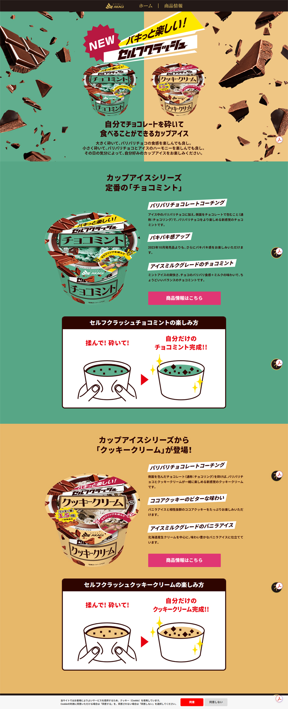
- The packaging of Akagi Nyugyo's 'Serufu Kurasshu' series features unique and dynamic design touches throughout to visually convey the product's main selling point: the hands-on experience of crushing it yourself.
1. Photo of the 'hand-rubbing and crushing action' In the latest design, a photograph of someone actually squeezing the cup by hand has been newly adopted so that the product's key appeal—the hand-rubbing action—is immediately apparent to users. The design makes it intuitively obvious "this is how you eat it!" without needing to read any text.
2. Dynamically scattering chocolate visuals The background and upper area of the package are dynamically illustrated with fragments of chocolate wildly scattering in all directions as they are snapped apart. This conveys the refreshing sensation of eating it and the fun of crushing the chocolate, making those feelings seem to overflow from the entire package.
3. Vivid color schemes by flavor Choco Mint: based on Akagi Nyugyo's familiar refreshing mint green, combined with a rich chocolate brown. Cookie Cream: based on vivid yellow and cream colors that evoke cookies and vanilla, with red and brown accents that pop and catch the eye.
4. Functional cup shape design The attention to the cup's shape extends beyond appearance to the balance of the container's height and diameter. It is designed at an ideal size that is easy for both men and women to hold by hand and comfortable to squeeze and crush, so that the package itself is designed as a "structure that is easy to crush."
【Note】 The landing page shown above was not designed by our company.
※You can view our production portfoliohere.
Clicking the design opens the source website.
*The original site may have been modified or removed.











