
LP design by New Graduate Recruitment Site
View PC page
View SP page

LP design by New Graduate Recruitment SiteLP information
- Registration date 2026-09-03
- https://newgrad.ntt-east.co.jp/
- Product/service name
- New Graduate Recruitment Site
- Categories
- Graduate recruitment
- Company name
- NTT Higashi-Nihon Kabushiki Kaisha()
- Color
- We design LPs using Shades of blue
- Image
- These LPs have a "Simple" style design
- Catchcopy
- Connect, Create.
- Design
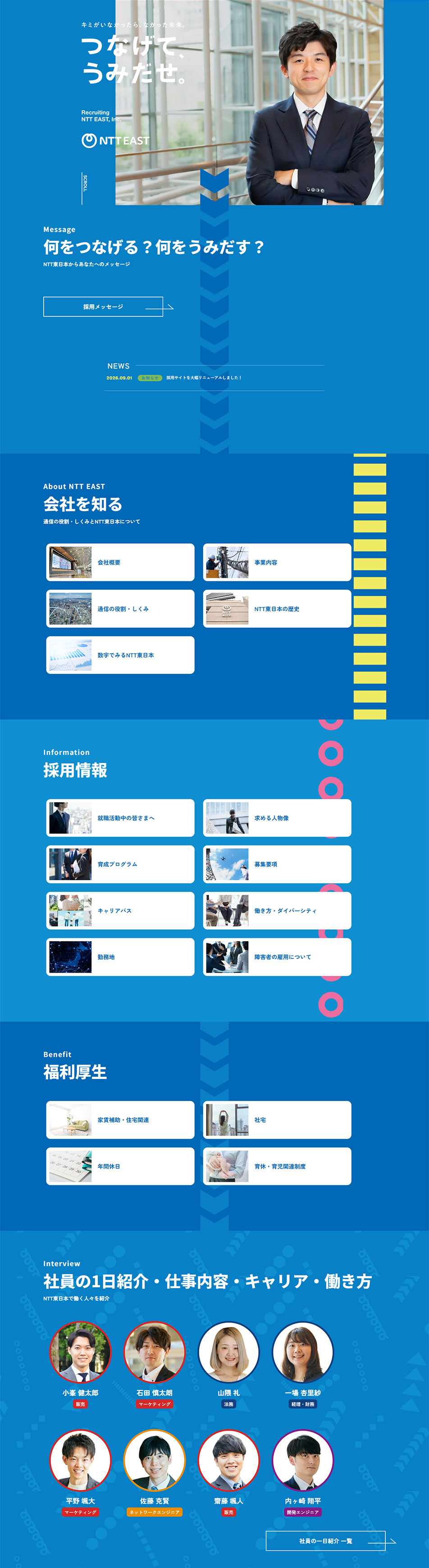
- This recruitment landing page design centers on the message 'Connect, Create,' expressing the company's future potential and human connections. It features a bold color scheme that uses vivid blue across the page, visually conveying the company's sense of trust, advancement, and the strength that supports society. In the hero section, a combination of portrait photography and a large catchphrase creates an impactful visual that places working people at the center.
The entire page is structured as a vertically oriented narrative, where centrally placed arrows and graphic motifs create a sense of flow for reading information and moving toward the future. Different tones of blue are used for each section, organizing diverse content such as company introduction, recruitment information, benefits, and employee profiles into a cohesive design.
Card-style content combines photos and text so information can be grasped intuitively. Rounded boxes and the use of whitespace create a friendly, easy-to-read impression even in digital contexts. Accent colors such as yellow and pink are also incorporated to convey a sense of youthfulness, diversity, and openness to the future.
In the employee interview section, portrait photos are placed in circular frames, a layout designed to spark interest in each individual's personality and career. Background patterns and icons express the world of communications and technology. By consistently applying the corporate brand colors and recruitment messaging, this recruitment landing page design delivers the company's appeal and the future of working to job seekers in an impactful way.
【Note】 The landing page shown above was not designed by our company.
※You can view our production portfoliohere.
Clicking the design opens the source website.
*The original site may have been modified or removed.








