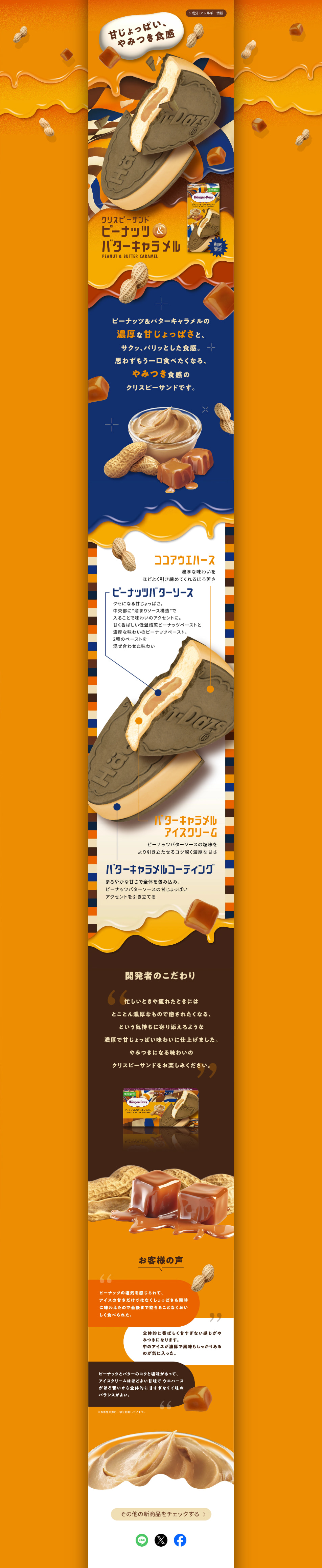
LP design by Peanuts & Butter Caramel
View PC page
View SP page

LP design by Peanuts & Butter CaramelLP information
- Registration date 2026-08-24
- https://www.haagen-dazs.co.jp/products/special/peanut-and-butter-caramel/
- Product/service name
- Peanuts & Butter Caramel
- Categories
- ice
- Company name
- Haagendattsu Japan Kabushiki-gaisha(Tokyo-to Meguro-ku)
- Color
- We design smartphone LPs using Orange tones
- Image
- These smartphone LPs have a "Cool style" style design
- Catchcopy
- Sweet and salty, addictive texture
- Design
- A refined visual centered on calm brown and caramel tones is very striking, effectively and visually conveying the rich, toasty flavors of the peanuts and butter caramel. By showing large product photos and sequentially introducing components such as peanut butter sauce, butter caramel coating, and the ice cream, the composition makes the flavor characteristics easy to understand intuitively. Furthermore, including the developer's particularities and customer voices creates a narrative around the product's background and appeal, naturally increasing the desire to "try it" beyond a mere product introduction. The layout, which makes use of photographic texture and white space, is also elegant, and while maintaining a Haagendattsu-like premium feel, it strongly emphasizes the sweet-and-salty, rich personality of the product, resulting in a highly complete design.
【Note】 The landing page shown above was not designed by our company.
※You can view our production portfoliohere.
Clicking the design opens the source website.
*The original site may have been modified or removed.