LP design by Jinjaa 10th Anniversary Special Site
View PC page
View SP page

LP design by Jinjaa 10th Anniversary Special SiteLP information
- Registration date 2026-08-21
- https://hcm-jinjer.com/10th-anniversary/sp=1
- Product/service name
- Jinjaa 10th Anniversary Special Site
- Categories
- Businesses, companies, stores
- Company name
- jinjer kabushiki gaisha(Tokyo-to Shinjuku-ku)
- Color
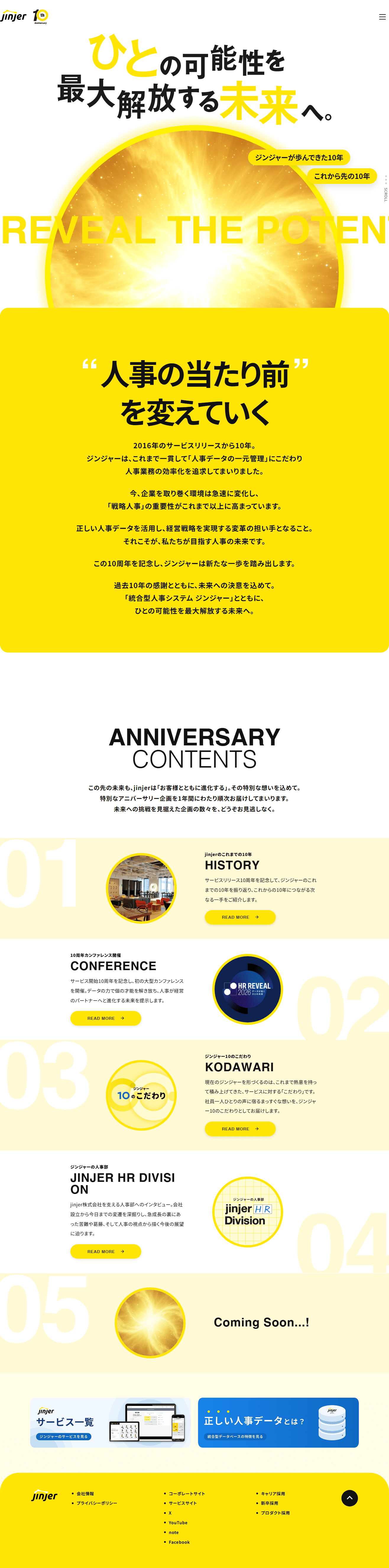
- We design smartphone LPs using yellow
- Image
- These smartphone LPs have a "Trust and Safety" style design
- Catchcopy
- Toward a future that unlocks people's full potential.
- Design
- The bold use of vivid yellow as the brand color is highly striking and very effective at conveying the specialness of the 10th anniversary and an optimistic energy toward the future. In the hero view, the large light visuals and strong typography intuitively communicate the message of 'a future that unlocks possibilities,' effectively emphasizing the brand's growth potential and its willingness to take on challenges. In addition, content such as the company history, conferences, special features, and business introductions is organized in a rhythmical layout that leverages numbers, so even long pages guide the viewer's eye naturally. The minimal design that makes use of white space, together with circular motifs and expressions of light, enhances overall cohesion and balances corporate credibility with an innovative image. Overall, I feel this is a highly accomplished anniversary site that blends the celebratory splendor of a brand milestone with the refined impression expected of BtoB services.
【Note】 The landing page shown above was not designed by our company.
※You can view our production portfoliohere.
Clicking the design opens the source website.
*The original site may have been modified or removed.