LP design by Nittoh Koucha 100th Anniversary Special Site
View PC page
View SP page
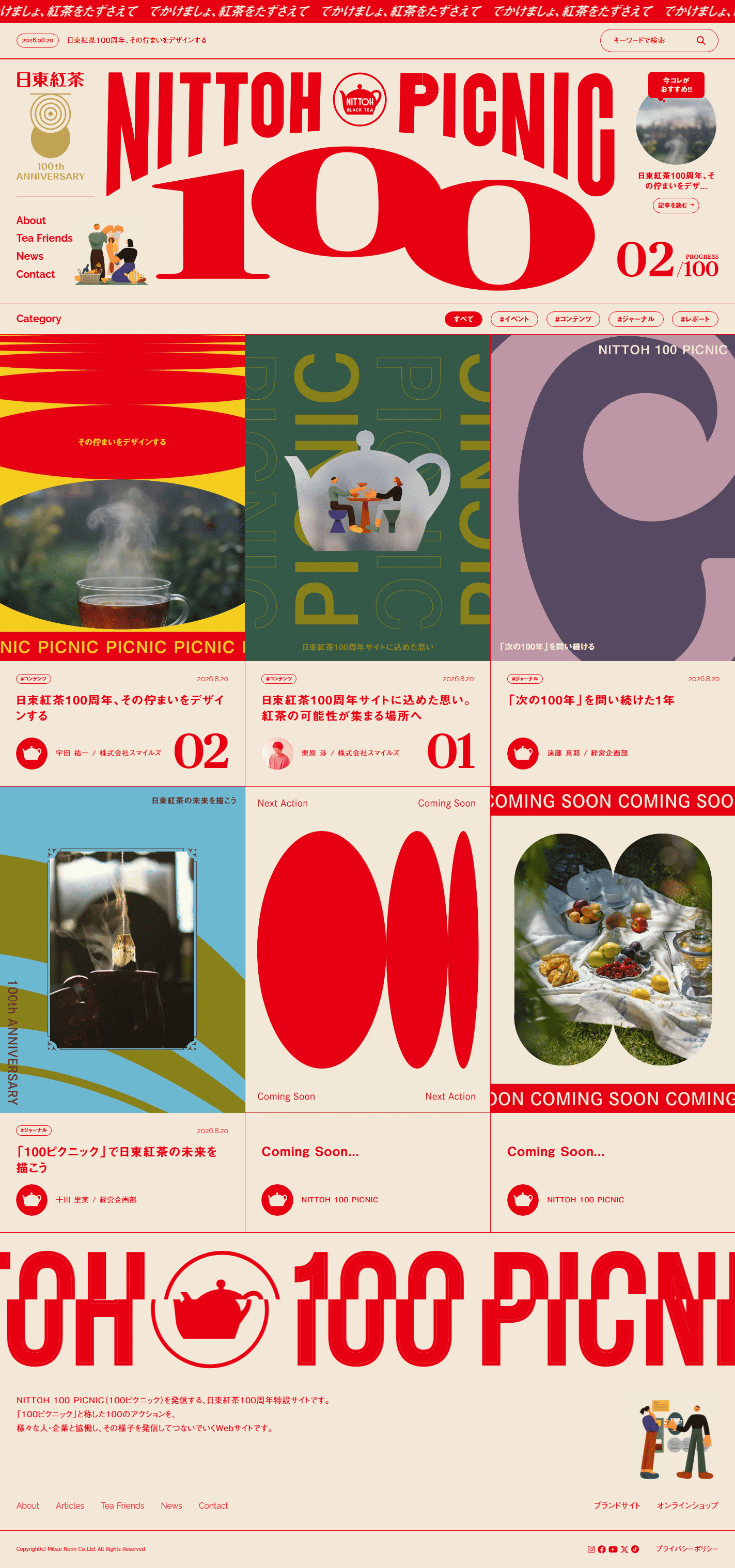
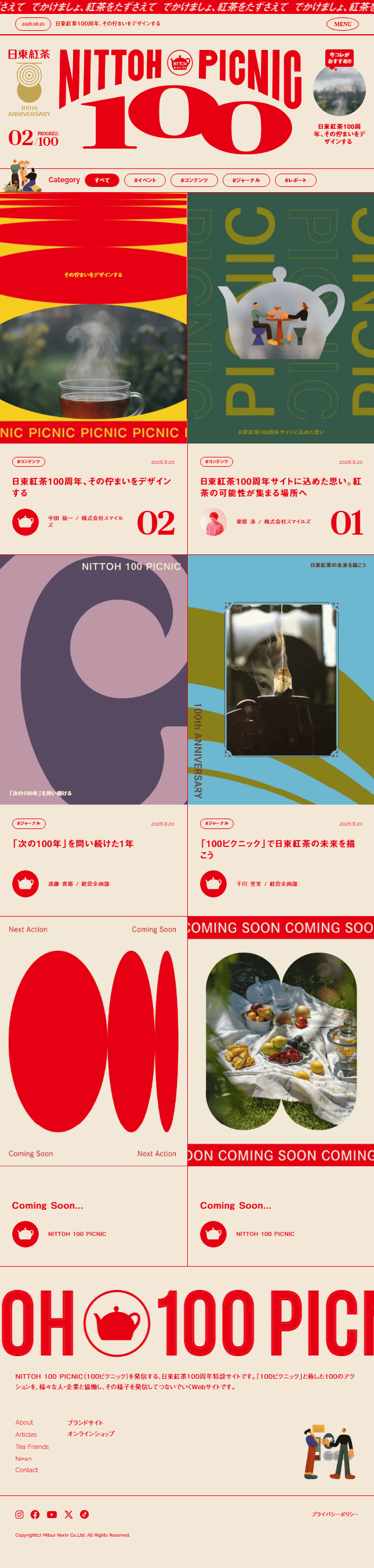
LP design by Nittoh Koucha 100th Anniversary Special SiteLP information
- Registration date 2026-08-21
- https://100th.nittoh-tea.com/sp=1
- Product/service name
- Nittoh Koucha 100th Anniversary Special Site
- Categories
- Events, Campaigns, Experiences
- Company name
- Mitsui Norin Kabushiki-gaisha(Minato-ku, Tokyo)
- Color
- We design smartphone LPs using Red tones
- Image
- These smartphone LPs have a "Arts" style design
- Catchcopy
- NITTOH100PICNIC
- Design
- The graphic expression that boldly makes red the protagonist is extremely striking, and it compellingly conveys the special feeling of the milestone of Nittoh Koucha’s 100th anniversary and the brand’s history. Large typography, bold whitespace, and a card-style layout create a rhythm to the information, resulting in a composition that allows you to enjoy an experience as if touring a magazine or an exhibition space. Furthermore, the visual expression that combines photographs, illustrations, and shapes is excellent, communicating the warmth of tea, human connections, and prospects for the future within a consistent worldview. The calm beige background contrasted with vivid red is also elegant, balancing the trustworthiness of a long-established brand with contemporary creativity. Overall, while expressing the narrative of the 100th anniversary through the design itself, it feels like a highly accomplished special site that lets users enjoyably engage with the brand’s journey and sentiments.
【Note】 The landing page shown above was not designed by our company.
※You can view our production portfoliohere.
Clicking the design opens the source website.
*The original site may have been modified or removed.