
LP design by theLetter
View PC page
View SP page

LP design by theLetterLP information
- Registration date 2026-08-20
- https://theletter.jp/
- Product/service name
- theLetter
- Categories
- Design, Apps, Systems
- Company name
- Kabushiki-gaishaOutNow(Tokyo-to)
- Color
- We design LPs using Beige tones
- Image
- These LPs have a "Arts" style design
- Catchcopy
- Have your own readers.
- Site Description
- Don't be swayed by the atmosphere of social media or by the preferences of publication platforms. theLetter is a platform where professionals and experts connect directly with their readers.
- Design
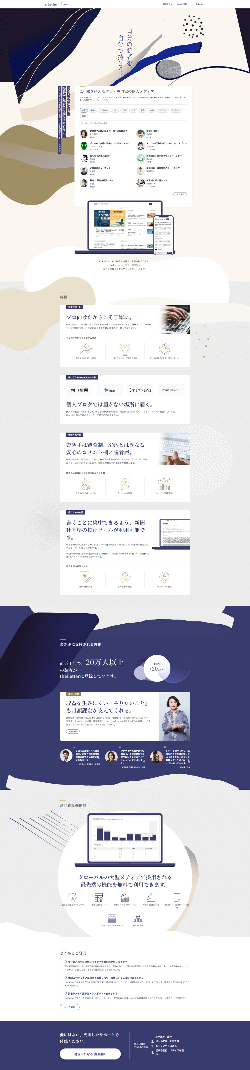
- This LP features a calm color palette centered on navy and beige and striking hand-drawn abstract graphics, resulting in a design that combines intellectual appeal with a sense of quality. Distinctive visuals that differ from typical service landing pages clearly convey the brand's world and effectively communicate its high level of expertise. The service's features, benefits of adoption, achievements, and user testimonials are organized step by step, making the content easy to understand even when there is a large amount of information. Additionally, by effectively combining photos, service screens, and diagrams, the design becomes more concrete and increases user trust. It is a memorable LP that balances a refined worldview with clear information design.
【Note】 The landing page shown above was not designed by our company.
※You can view our production portfoliohere.
Clicking the design opens the source website.
*The original site may have been modified or removed.









