LP design by Internship
View PC page
View SP page

LP design by InternshipLP information
- Registration date 2026-08-19
- https://www.fujita.co.jp/recruit/fresher/internship/index.html
- Product/service name
- Internship
- Categories
- Graduate recruitment
- Company name
- Kabushiki Kaisha Fujita()
- Color
- We design smartphone LPs using Orange tones
- Image
- These smartphone LPs have a "Simple" style design
- Catchcopy
- Fujita: Building People.
- Design
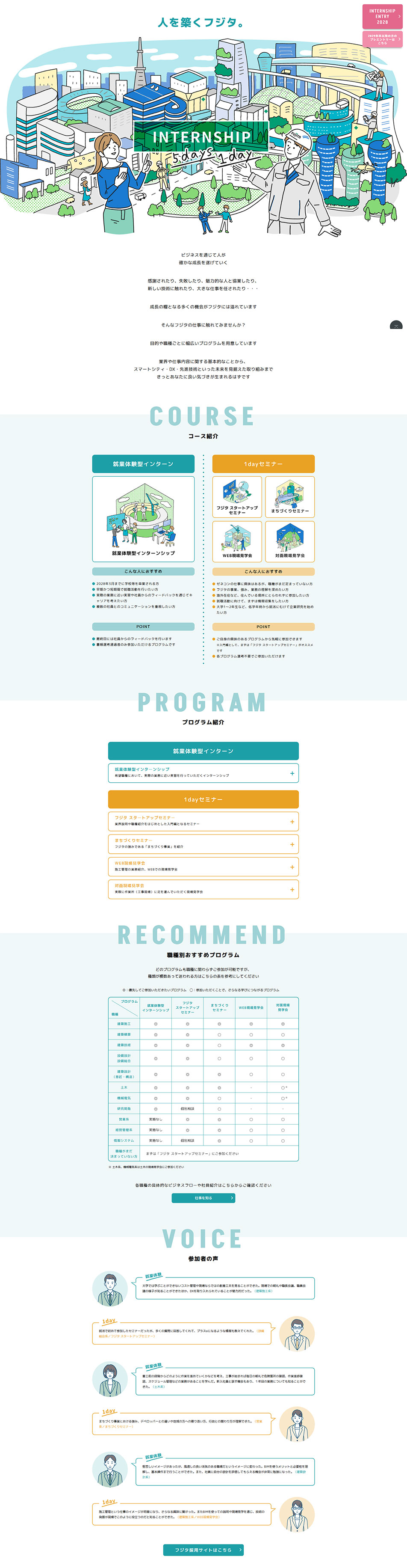
- This LP is designed to present corporate internships as an 'accessible, enjoyable experience that can be understood while having fun.' In the first view, a large illustration depicting a city, buildings, and working people is placed to intuitively convey the scale of the company and the work. By focusing on illustrations rather than photographs, it gives a soft, approachable impression even to students who have just started job hunting.
The color scheme centers on turquoise blue, using orange and pink as accents. By assigning different colors to each course to organize information, the page as a whole has a bright, fresh sense of unity. Sections are clearly divided with large English headings like "COURSE", "PROGRAM", "RECOMMEND", and "VOICE", making it easy to grasp your current location and the grouping of information even on a long, vertical LP.
Another key point is that information is presented in order according to the stage of consideration, such as a course comparison table, program details, and participant voices. The design incorporates illustrations, speech bubbles, and card-style UI throughout, creating an LP design well suited to recruitment and internship campaigns that is informative yet enjoyable to read.
【Note】 The landing page shown above was not designed by our company.
※You can view our production portfoliohere.
Clicking the design opens the source website.
*The original site may have been modified or removed.