
LP design by Maiasa Sokai
View PC page
View SP page

LP design by Maiasa SokaiLP information
- Registration date 2026-08-07
- https://www.morinagamilk.co.jp/products/brand/maiasa_soukai/2026new/
- Product/service name
- Maiasa Sokai
- Categories
- Health foods, health drinks, and supplements
- Company name
- Morinaga Nyugyo Kabushiki Gaisha(Tokyo-to Minato-ku Higashi-Shinbashi 1-chome 5-ban 2-go)
- Color
- We design smartphone LPs using Pink shades
- Image
- These smartphone LPs have a "Cute style" style design
- Catchcopy
- Helps maintain skin elasticity and increase bowel regularity to support skin health.
- Design
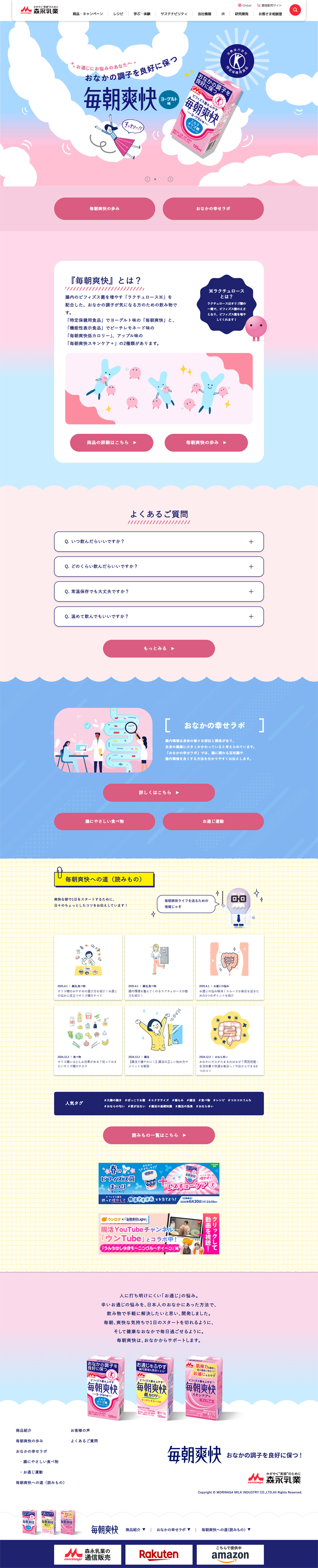
- 1. Tone and manner (color scheme) Pink × Blue gradient The pink of the product packaging and a blue that evokes the refreshing morning sky serve as the foundation. Femininity and gentleness (pink) and a crisp sense of cleanliness and refreshment (blue) are expressed simultaneously. 2. Worldview and first view: Sky and cloud motif Fluffy spreading “cloud” illustrations are incorporated at the top of the page and as section dividers. This creates the airy feeling of a clear, pleasant morning appropriate for the product name "Maiasa Sokai." 3. Use of illustrations and characters: Friendly characters Original, cute rabbit-like characters are scattered throughout, turning the somewhat delicate theme of stomach concerns into something bright and positive. In the middle and lower explanatory/problem sections, simple hand-drawn style illustrations are used so that specialized functions (Rakuchuroosu, etc.) do not feel difficult and are communicated visually in an easy-to-understand way. 4. Content readability and layout: Wave-shaped section dividers Each block boundary is wave-shaped, giving rhythm and a pop impression to the entire page. Buttons with clear contrast (CTA) Against a pale pastel background, the buttons that lead to purchase or details use a deeper pink to naturally guide the viewer’s gaze. Overall, it completely removes the stiffness often found in health food designs and results in a catchy, gentle design that makes one feel they could happily continue it every day.
【Note】 The landing page shown above was not designed by our company.
※You can view our production portfoliohere.
Clicking the design opens the source website.
*The original site may have been modified or removed.











