
LP design by Rakutoferin200
View PC page
View SP page

LP design by Rakutoferin200LP information
- Registration date 2026-08-07
- https://www.morinagamilk.co.jp/lactoferrin/
- Product/service name
- Rakutoferin200
- Categories
- Health foods, health drinks, and supplements
- Company name
- Morinaga Nyugyo Kabushiki Kaisha(Tokyo-to Minato-ku Higashi-Shimbashi 1-chome 5-ban 2-go)
- Color
- We design LPs using Shades of blue
- Image
- These LPs have a "Simple" style design
- Catchcopy
- Japan's first immunity support beverage
- Design
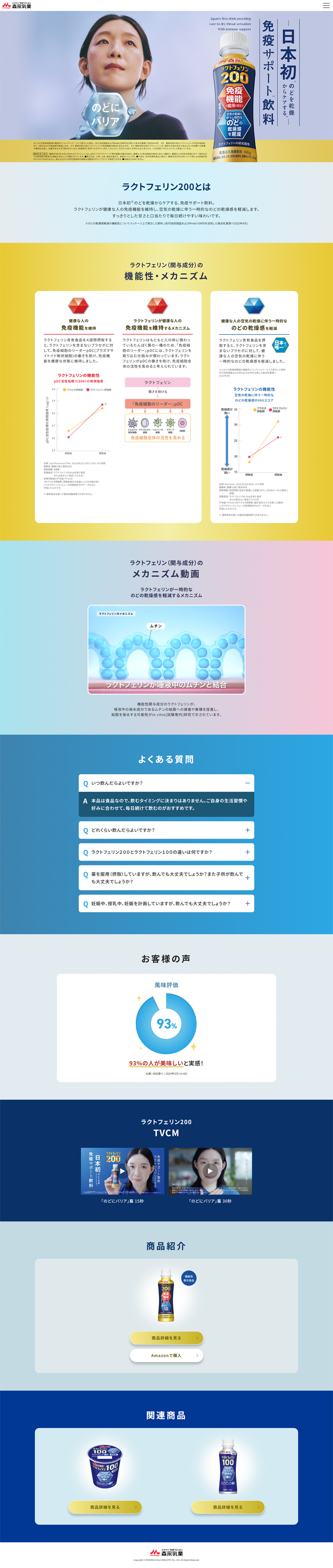
- 1. Contrast of “blue × gold” coordinated with the package — trustworthiness and a sense of luxury: The package’s key color, deep navy (Deep Blue), is used as the base and combined with gold (yellow) as an effective accent. Guiding the viewer’s gaze: By placing gold on the numbers you most want to draw attention to (such as “200”) and on the purchase button (CTA), the design is intended to naturally direct the user’s eyes to important elements. 2. Gradient that evokes “air” and “throat moisture” — a refreshing background design: In the first view and the mechanism explanation sections, a beautiful gradient from clear light blue at the top to white is used. Visualization of benefits: This refreshing color scheme intuitively conveys the drinking benefits of the product — relieving throat dryness and maintaining a clean, hydrated state. 3. Placement of illustrations and diagrams that communicate intuitively — visualizing the barrier mechanism: In the midsection zone that changes from pink to blue, the mechanism of forming a “barrier on the throat” is illustrated at a glance using cute 3D cell illustrations. Presentation of evidence: Graphs and clinical data are simply expressed with clean red and blue lines, making the scientific basis of foods with functional claims — which can otherwise become complex — clear and easy to read. 4. Graphing “user voices (customer feedback)” to increase trust — fostering reassurance: At the bottom, the figure “93% satisfied” is boldly displayed in a large pie chart. This has a stronger visual impact than listing text alone and gives hesitant purchasers a strong sense of reassurance.
【Note】 The landing page shown above was not designed by our company.
※You can view our production portfoliohere.
Clicking the design opens the source website.
*The original site may have been modified or removed.











