
LP design by MiraiPlusPurotein
View PC page
View SP page


LP design by MiraiPlusPuroteinLP information
- Registration date 2026-08-07
- https://www.morinagamilk.co.jp/products/brand/woman-wellness/
- Product/service name
- MiraiPlusPurotein
- Categories
- Health foods, health drinks, and supplements
- Company name
- Morinaga Nyugyo Kabushikigaisha(Tokyo-to Minato-ku Higashi-Shimbashi 1-chome 5-ban 2-go)
- Color
- We design smartphone LPs using White-based
- Image
- These smartphone LPs have a "Simple" style design
- Catchcopy
- Nutrition that supports my tomorrow
- Design
- 1. Color palette and tone
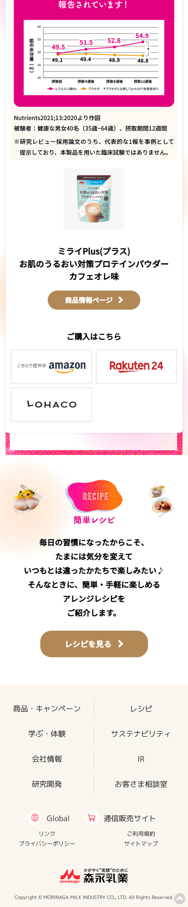
Magenta-pink accents: Use vivid pink for buttons and important areas to guide the viewer's gaze. Soft gradient background: Use soft circular gradients of pink and yellow to create a warm, gentle atmosphere.
2. Friendly visuals
Watercolor-style illustrations: Illustrate calm everyday moments between dogs and their owners to provide reassurance to the target audience (dog owners, especially women). Rounded design elements: Round the backgrounds of headlines, borders, and button corners to eliminate visual harshness.
3. Readability of information and layout
Clean vertical flow: Organize each section so it flows from "concerns" to "solutions (ingredients/products)", making it easy to scroll. Visualization of graphs and figures: Show clinical data and component ratios with simple bar and line charts to provide visual credibility.
4. Clear conversion (CTA) design
Prominent purchase button: Place buttons in gold or deep pink so users are not left wondering what action to take next.
5. Branding aligned with the packaging
Apply the gentle, natural image of the product packaging (pastel colors and illustrations) across the entire website.
Morinaga NyugyoMorinagaNyugyomorinagaMorinagamorinagaMORINAGAmorinyuuNutrition that supports my tomorrowMiraiPlusPuroteinproteinproteinIron jelly providing one day's worth of ironiron
【Note】 The landing page shown above was not designed by our company.
※You can view our production portfoliohere.
Clicking the design opens the source website.
*The original site may have been modified or removed.











