
LP design by Kuriipu
View PC page
View SP page

LP design by KuriipuLP information
- Registration date 2026-08-07
- https://www.creap.jp/2026new
- Product/service name
- Kuriipu
- Categories
- Health foods, health drinks, and supplements
- Company name
- Morinaga Nyugyo Kabushiki Kaisha(Tokyo-to Minato-ku Higashi-Shinbashi 1-chome 5-ban 2-go)
- Color
- We design smartphone LPs using Beige tones
- Image
- These smartphone LPs have a "Simple" style design
- Catchcopy
- Creap — its deliciousness is born from milk.
- Design
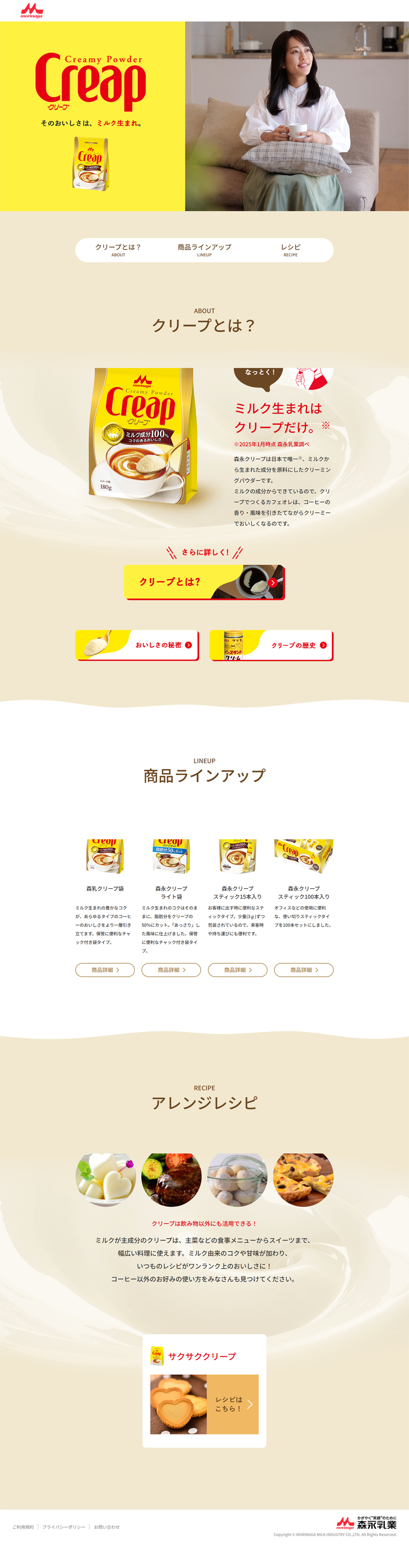
- 1. Soft color palette that expresses a "milk sensation": instead of pure white, the base uses a slightly warm cream color (ivory). Accent: The package's key colors, "vibrant yellow" and "red (logo)", are placed effectively to increase brand recognition. 2. Sections with an organic wave background that suggest fluidity are represented not by straight lines but by gentle wave patterns like those when milk is mixed. This naturally guides the viewer's gaze downward and gives the entire site a pleasant rhythm and soft impression. 3. A clean layout that takes advantage of whitespace: text and images are not overcrowded, and sufficient whitespace is secured. This creates the cleanliness, sense of security, and premium feeling important for food brands. 4. Visuals that evoke scenes: in the top area (first view), a large photo of a woman relaxing at home while drinking coffee is placed to intuitively evoke the "rich time" associated with the product. In the lower arrangement recipes, food photos are cropped into circles to add a gentle, homely atmosphere.
Morinaga NyugyoKuriipucreapmilkcow's milkpowderedpowdered creamlow-fatcoffeemilk teacreamfresh creamrecipeportioninstant creaminstant cream powder
【Note】 The landing page shown above was not designed by our company.
※You can view our production portfoliohere.
Clicking the design opens the source website.
*The original site may have been modified or removed.











