
LP design by Miruku Seikatsu
View PC page
View SP page


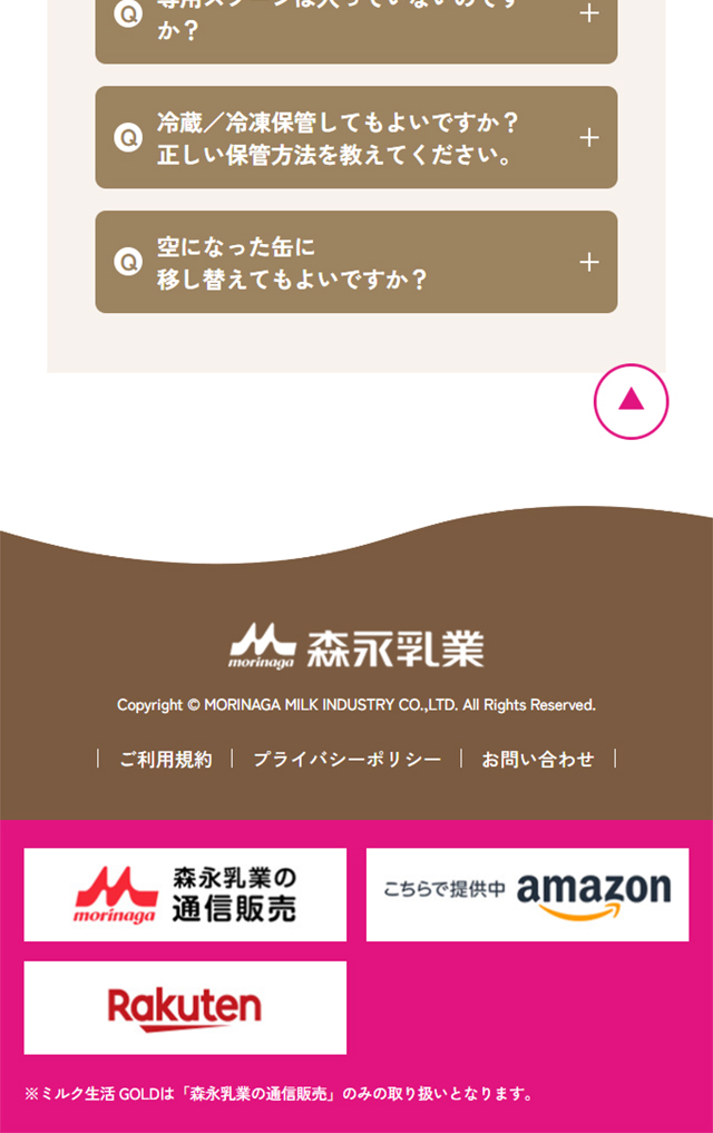
LP design by Miruku SeikatsuLP information
- Registration date 2026-08-07
- https://www.milklife.morinagamilk.co.jp/2026new/
- Product/service name
- Miruku Seikatsu
- Categories
- Health foods, health drinks, and supplements
- Company name
- Morinaga Nyugyo Kabushiki-gaisha(Tokyo-to Minato-ku Higashi-Shinbashi 1-chome 5-ban 2-go)
- Color
- We design LPs using White-based
- Image
- These LPs have a "Trust and Safety" style design
- Catchcopy
- Deliciously supplements calcium and nutrients that tend to be lacking — Miruku Seikatsu
- Design
- 1. Choosing fonts that empathize with the target audience
Rounded fonts: Using rounded fonts (rounded gothic-style, etc.) for titles and headings gives a gentle, friendly impression. Large text sizes: Important figures and selling points are emphasized with larger, bolder text so that seniors can read them on smartphones or other screens without strain.
2. A color palette that conveys gentleness and cleanliness
Pink and magenta accents: Soft pinks and bright magenta colors are placed at key points to add a touch of elegance and a tone that is approachable for mature women. Whites and cream colors that evoke milk: Soft whites, ivories, and light beiges are used for backgrounds and base colors to highlight the product’s purity, sense of safety, and appetizing image as “milk.”
3. A visual layout that communicates intuitively
Use of illustrations and icons: Health ingredients such as lactoferrin and calcium are presented with cute circular icons to make complex nutritional information easy to understand at a glance. Clear contrast between packaging and products: The regular version (can type) and individually wrapped (stick type) are neatly compared in a clean vertical card-style layout.
4. Layout structure that builds trust
Clean white space: Adequate margins (white space) are placed on the left and right of the screen and between content blocks so information does not blend together, guiding the viewer’s gaze smoothly from top to bottom.
Morinaga Nyugyomilklifestylefor adultspowdered milkhealth foodlactoferrinbifidobacteriaBB536shield lactic acid bacteriacalciummedium-chain fatty acidsiron
【Note】 The landing page shown above was not designed by our company.
※You can view our production portfoliohere.
Clicking the design opens the source website.
*The original site may have been modified or removed.











