
LP design by TheLastRun
View PC page
View SP page

LP design by TheLastRunLP information
- Registration date 2026-08-06
- https://www.jr-odekake.net/navi/the_last_run/
- Product/service name
- TheLastRun
- Categories
- Domestic and international travel
- Company name
- Nishi Nihon Ryokaku Tetsudo Kabushiki-gaisha(Osaka-shi Kita-ku Shibata 2-chome 4-ban 24-go)
- Color
- We design smartphone LPs using yellow
- Image
- These smartphone LPs have a "Strong" style design
- Catchcopy
- Thank you! Goodbye!
- Site Description
- This is the official website page for 'TheLastRun'.
- Design
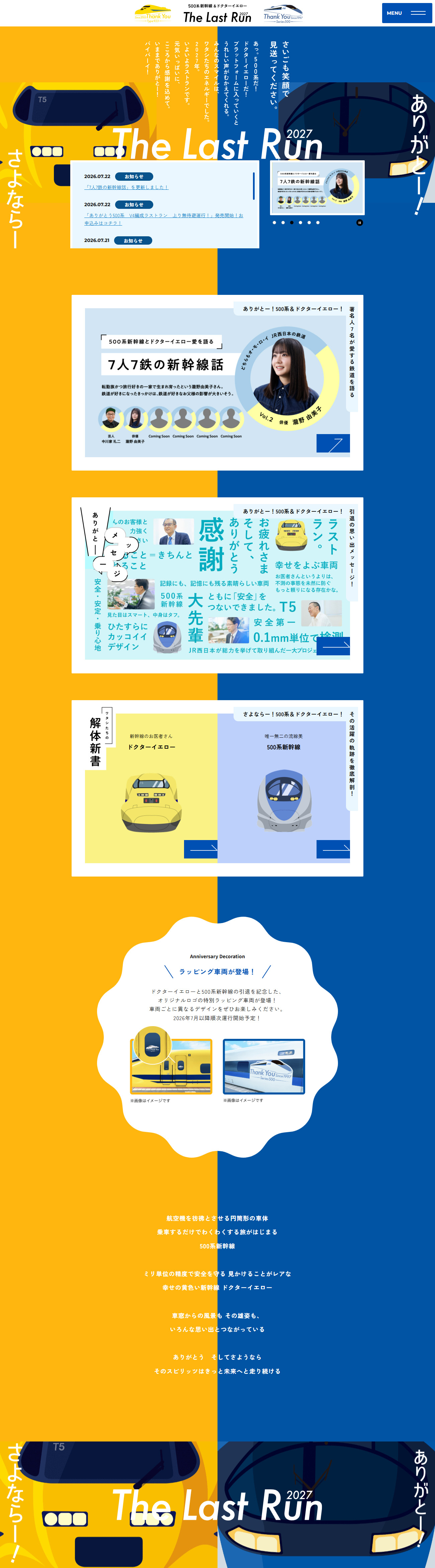
- A layout that boldly splits yellow and blue down the center of the screen is very striking, and it is appealing in how it creates a strong impact and sense of unity across the page while symbolically representing the two presences of Dokutaa Ieroo and the 500-kei Shinkansen. In the first view, large train visuals and powerful typography draw the eye, creating a composition that intuitively communicates the theme 'TheLastRun' and naturally heightens the sense of occasion and emotion as a commemorative project. Furthermore, because news, feature content, and wrapped train introductions are presented in a card-style layout with good tempo, the design remains easy to read even with a large amount of information, and each scroll invites interest in new content. The balanced combination of illustrations and photographs and the use of curved decorative elements add a sense of approachability, producing a world that not only train enthusiasts but a wide range of users can enjoy. Overall, the consistency in color scheme, typography, and visual tone makes this a highly accomplished design that successfully fuses storytelling as a commemorative project with brand image.
【Note】 The landing page shown above was not designed by our company.
※You can view our production portfoliohere.
Clicking the design opens the source website.
*The original site may have been modified or removed.











