
LP design by SummerFallJapan
View PC page
View SP page
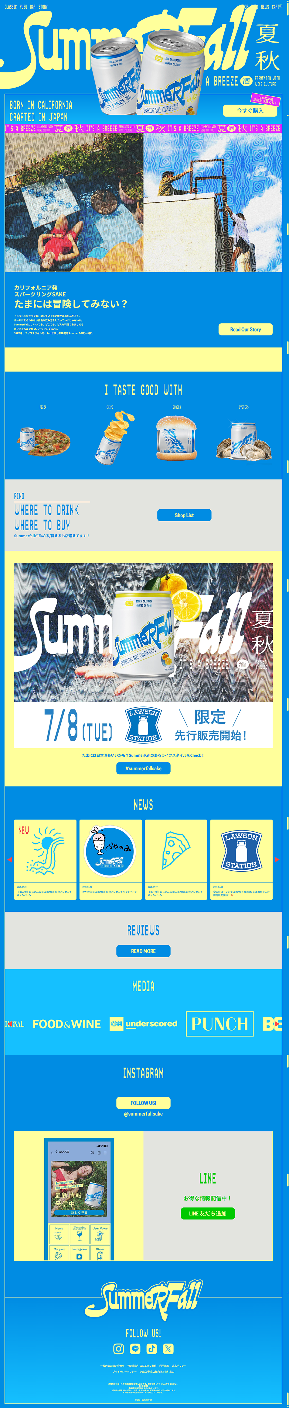

LP design by SummerFallJapanLP information
- Registration date 2026-08-06
- https://summerfallsake.jp/
- Product/service name
- SummerFallJapan
- Categories
- Beer and Happoshu
- Company name
- SummerFallJapan()
- Color
- We design LPs using Shades of blue
- Image
- These LPs have a "Arts" style design
- Catchcopy
- Why not go on an adventure once in a while?
- Design
- This page is designed as a brand site that emphasizes a refreshing feeling, playfulness, and a sense of culture with the theme "the boundary between summer and autumn".
Blue, which evokes blue skies and a sense of coolness, and an accent yellow are used to create a summery atmosphere.
The "SummerFall" logo is placed prominently, also giving a 90s-style, American pop impression.
As a visually focused brand landing page, it is highly polished and is designed to sell "experience and worldview" rather than "products." Its vivid color palette, bold typography, and art-like photographic expression successfully differentiate it from typical Japanese sake sites.
【Note】 The landing page shown above was not designed by our company.
※You can view our production portfoliohere.
Clicking the design opens the source website.
*The original site may have been modified or removed.











