
LP design by YOSHINOSATO
View PC page
View SP page
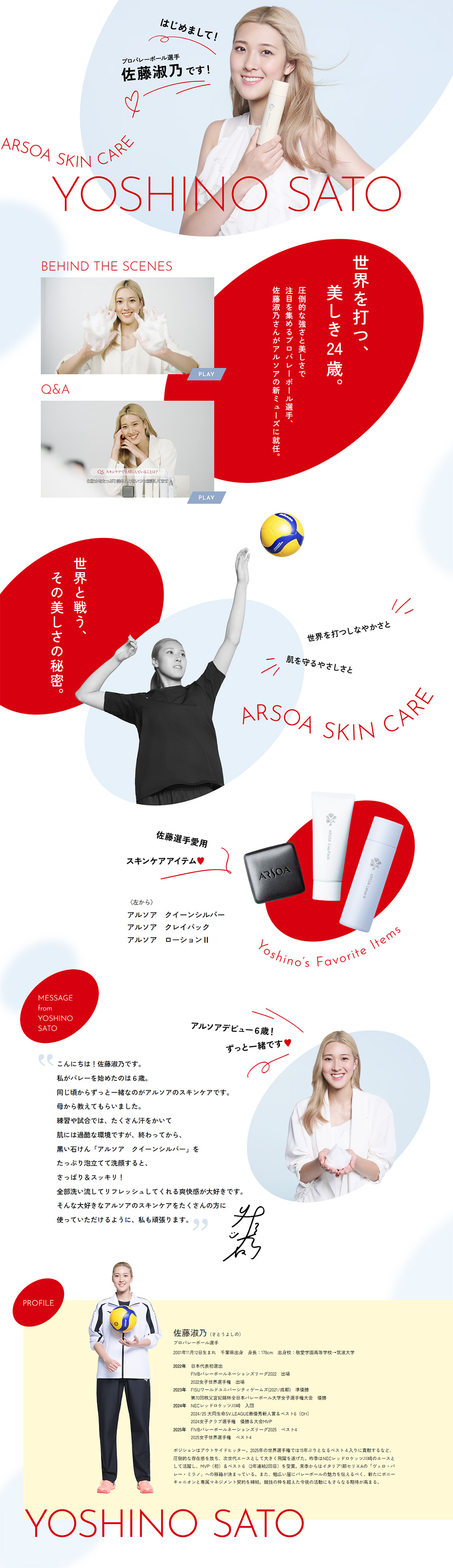

LP design by YOSHINOSATOLP information
- Registration date 2026-08-05
- https://www.arsoa.co.jp/yoshinosato/
- Product/service name
- YOSHINOSATO
- Categories
- Skincare, Bodycare, Haircare
- Company name
- ARSOA(Yamanashi-ken Hokuto-shi)
- Color
- We design LPs using White-based
- Image
- These LPs have a "Simple" style design
- Catchcopy
- Nice to meet you! I'm professional volleyball player Yoshino Sato!
- Design
- The brand color, 'red', which symbolizes energy, is arranged in soft, dynamic shapes such as circles and ovals. They serve to smoothly guide the viewer's gaze downward as the page is scrolled, creating a pleasant sense of rhythm on long pages that can otherwise become flat.
It skillfully juxtaposes volleyball attack scenes (monochrome-toned, dynamic shots) with portraits of clear, translucent skin (high-key, clean-feeling shots). It visually and convincingly conveys the product's high functionality and persuasive appeal, showing that it preserves beautiful skin even while sweating during intense sports.
【Note】 The landing page shown above was not designed by our company.
※You can view our production portfoliohere.
Clicking the design opens the source website.
*The original site may have been modified or removed.











