
LP design by TOFT
View PC page
View SP page

LP design by TOFTLP information
- Registration date 2026-07-31
- https://toft.jp/
- Product/service name
- TOFT
- Categories
- Interior,Accessories,Miscellaneous goods
- Company name
- TOFT()
- Color
- We design LPs using Shades of grey
- Image
- These LPs have a "Simple" style design
- Catchcopy
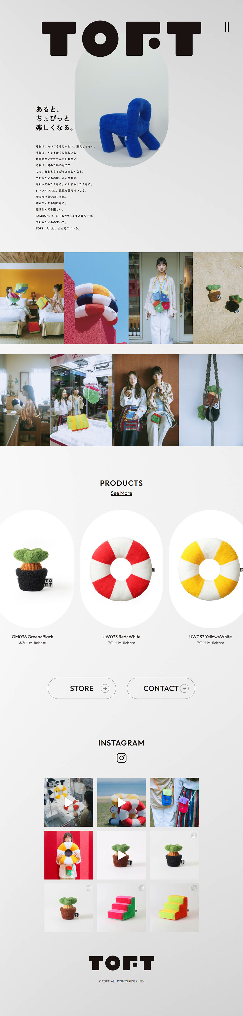
- Having it around makes things a little bit more fun.
- Design
- It features designs that embody a unique worldview crossing the boundaries of fashion, art, and toys, characterized by a coexistence of playfulness and refinement.
In terms of color scheme, it is structured around simple and minimal base colors while highlighting the product's vivid two-tones and hues. The emotional brand message "Having it around makes things a little bit more fun." is strikingly placed through typography that takes advantage of pleasant whitespace.
Structurally, practical explanations are deliberately pared down, and following a poetic concept statement, a colorful product list and an Instagram visual gallery are displayed in a grid. The intuitive visuals and refined layout create a sophisticated UI design that directly conveys the brand's genreless, flexible atmosphere.
【Note】 The landing page shown above was not designed by our company.
※You can view our production portfoliohere.
Clicking the design opens the source website.
*The original site may have been modified or removed.











