
LP design by Kabushiki-gaisha We (WeInc.)
View PC page
View SP page

LP design by Kabushiki-gaisha We (WeInc.)LP information
- Registration date 2026-07-24
- https://wewewe.jp/
- Product/service name
- Kabushiki-gaisha We (WeInc.)
- Categories
- Businesses, companies, stores
- Company name
- Kabushiki-gaisha We(Tokyo-to Meguro-ku)
- Color
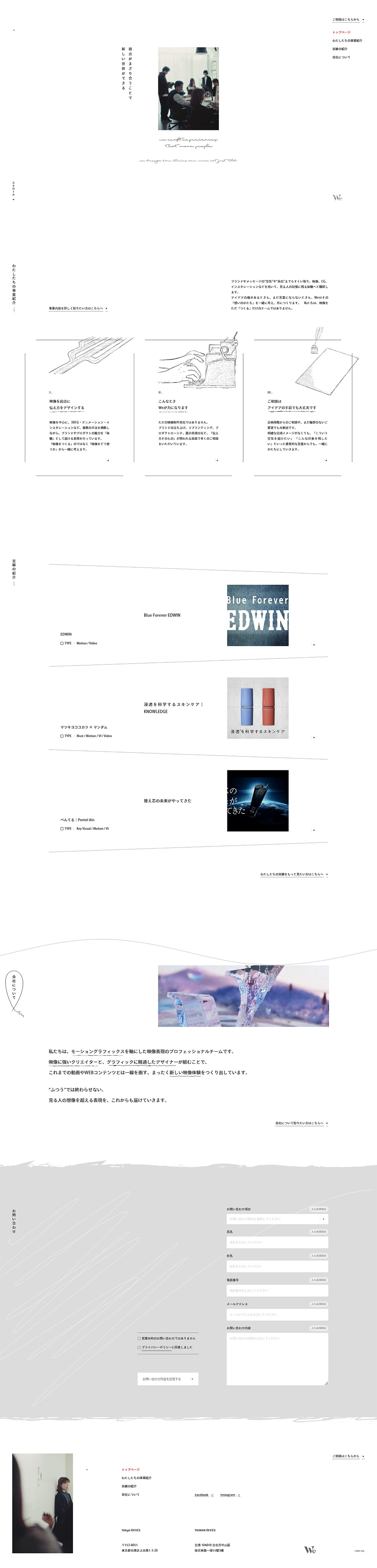
- We design smartphone LPs using White-based
- Image
- These smartphone LPs have a "Arts" style design
- Catchcopy
- A new world is created when perspectives blend together
- Site Description
- We focus our activities on motion graphics. Because our team brings together experts in video and experts in graphics, we produce and deliver visuals that allow people to experience a new added value different from conventional video, graphics, or web.
- Design
- The boldly generous use of white space, delicate layouts, slender typography, and vertical headlines combine to create a uniquely calm and refined atmosphere that is very appealing. By intentionally placing photographs and hand-drawn-style line art small, each element naturally draws the eye, conveying the company’s meticulous approach and refined sensibility as a production firm. Also, while the design is based on a monochrome palette, the inclusion of ruled lines and the rhythm of margins like printed pages, soft wavy lines, and rough brushstrokes prevents it from feeling too mechanical, resulting in a finish that conveys the warmth of handwork and a human touch. Case studies, the company’s way of thinking, and the flow toward inquiries are all organized within this restrained design; rather than forcefully pushing information, it encourages careful reading while communicating the brand’s philosophy. I feel it is a quiet, sophisticated, and highly accomplished design.
video productionmotion graphicsbrandingCG/animationinstallationvisual expressiondesign productionvideo productionplanning and directioncreative agency
【Note】 The landing page shown above was not designed by our company.
※You can view our production portfoliohere.
Clicking the design opens the source website.
*The original site may have been modified or removed.











