LP design by Puccho
View PC page
View SP page

LP design by PucchoLP information
- Registration date 2026-07-17
- https://puccho.jp/aegroup/
- Product/service name
- Puccho
- Categories
- Snack foods, gum, and candy
- Company name
- UHA Mikakuto()
- Color
- We design LPs using Shades of blue
- Image
- These LPs have a "Refreshing type" style design
- Catchcopy
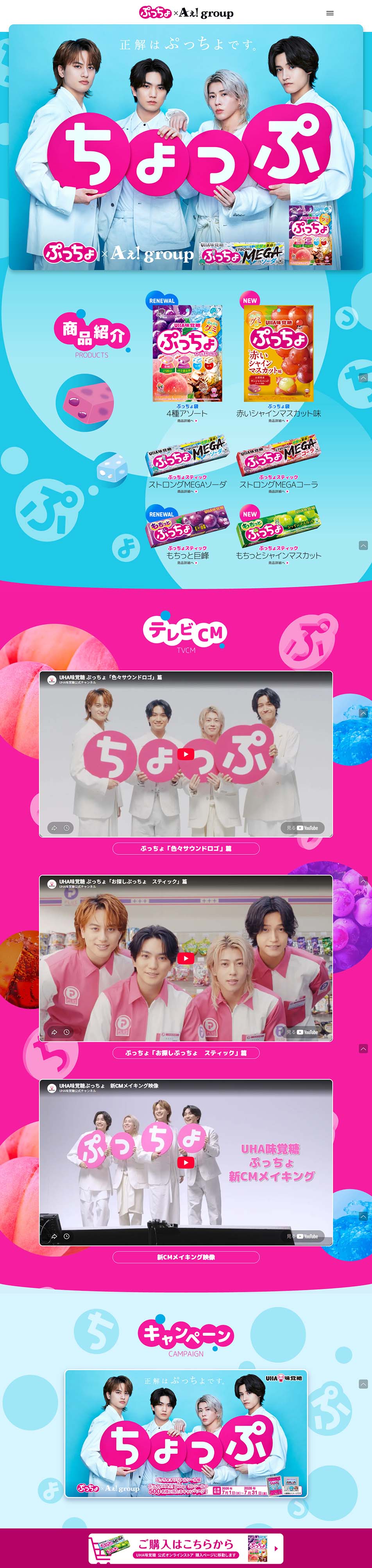
- The correct answer is Puccho.
- Design
- The LP is a highly accomplished design as a brand promotion centered not on product appeal but on an "entertainment experience."
A strong point is that it places the visuals and videos of Ae!group at the forefront, emphasizing the brand's fun and approachability. By aggregating CMs, making-of footage, and campaign information on a single page, it makes it easy for fans to browse and naturally extends the time they spend engaging with the brand.
Also, Puccho's characteristic pop and colorful color palette and large visuals create a design in which the product's world and the talent's appeal are integrated. Because the amount of information is kept to the bare minimum, it is also notable that users can enjoy it intuitively.
On the other hand, because the structure is not intended to convey the product's functions or features in detail and instead focuses on brand awareness and encouraging campaign participation, its role in deepening product understanding is limited.
Overall, as a campaign LP aimed at enhancing brand image and generating buzz, it is highly accomplished and can be assessed as a design excellent in entertainment value that attracts users through visuals and content.
【Note】 The landing page shown above was not designed by our company.
※You can view our production portfoliohere.
Clicking the design opens the source website.
*The original site may have been modified or removed.