LP design by Experience event 'iwakutsuki no baggu'
View PC page
View SP page

LP design by Experience event 'iwakutsuki no baggu'LP information
- Registration date 2026-07-15
- https://i-ku-kan.com/iwakutsuki_no_bag
- Product/service name
- Experience event 'iwakutsuki no baggu'
- Categories
- Events, Campaigns, Experiences
- Company name
- Kabushiki Gaisha Kyujitsu Hakku(Tokyo-to Taito-ku)
- Color
- We design LPs using Shades of blue
- Image
- These LPs have a "Simple" style design
- Catchcopy
- iwakutsuki no baggu
- Design
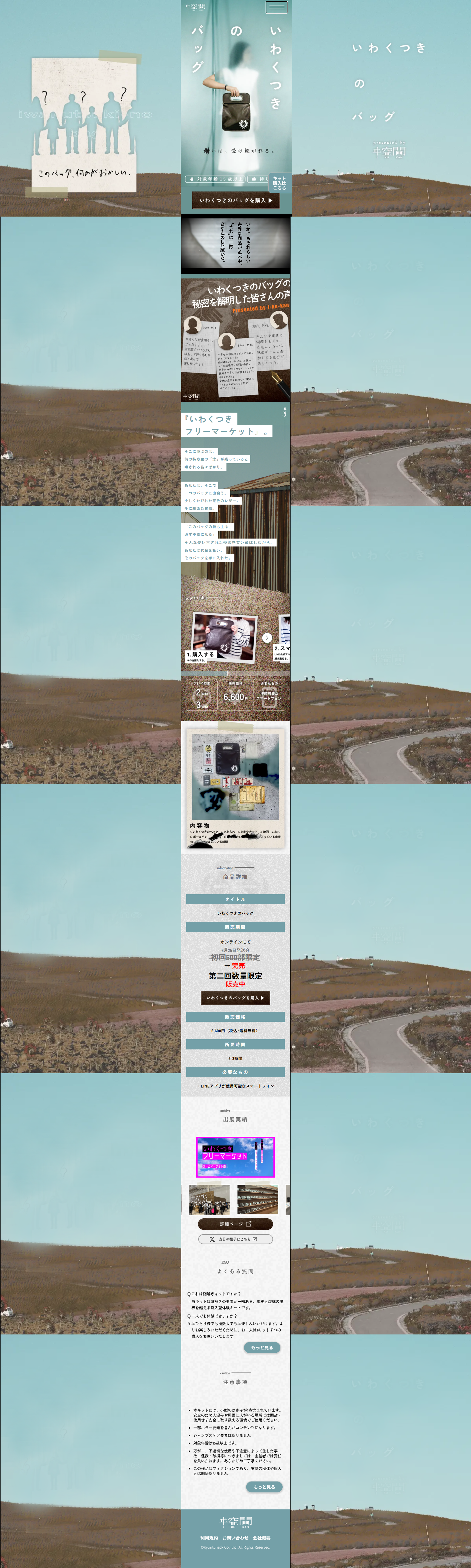
- 1. An analog-and-digital hybrid expression conscious of the 'uncanny valley'
The eeriness of this site lies in a subtle boundary design that makes it hard to tell whether something is real or fictional (man-made).
Instead of neatly prepared web fonts, uneven characters that look as if handwritten and coarse textures as if old documents or medical charts were scanned are used.
Blurs at the edges of the screen (the phenomenon of chromatic aberration where red and blue light shift) and visual effects like VHS-style noise (a noise filter) create a sense in the brain that 'something is glitching (not normal).'
2. Dark color palette that strikes at human physiological aversion
Colors that evoke death and decay: bright whites and fresh blues are excluded. The base is dark earth tones that trigger human defensive instincts—sunk black, rust-like browns, and murky reds (a dark red reminiscent of blood).
Limited lighting expression: a high-contrast lighting that makes only parts stand out as if illuminated by a single flashlight is used. The more unseen areas (darkness) there are, the more humans imagine fear in them, and this strong contrast generates psychological tension.
3. Motif arrangement reminiscent of conservative, tradition-based 'folk horror'
This work is conceived as a flea market where items carry the 'lingering energy' of previous owners.
Scattered across the site are unsettling objects of 'the uncanny hidden in everyday life'—photos of worn brown leather bags, handwritten notes, old photographs, ofuda (paper talismans), and strange marks.
Instead of clean product shots, deliberately using 'raw photos taken with a smartphone in a dim room' produces a vividness (immersion) that makes the objects feel as if they could exist right next to you.
4. An unfriendly, quiet UI that pushes users away
There are no prominent 'Buy now!' style buttons like on Daian's site, nor the neat, beautiful navigation of ByUR.
Text information is deliberately kept sparse, with large amounts of whitespace (darkness), and a layout that conveys a 'quietness' suggesting eerie sounds or silence.
By forcing users to act—'if you want to see it, scroll and peer in of your own volition'—the structure increases a creeping self-induced fear each time they scroll, as if 'something unpleasant might appear.'
【Note】 The landing page shown above was not designed by our company.
※You can view our production portfoliohere.
Clicking the design opens the source website.
*The original site may have been modified or removed.