
LP design by Kabushiki Kaisha Shincho Puresu
View PC page
View SP page

LP design by Kabushiki Kaisha Shincho PuresuLP information
- Registration date 2026-07-10
- https://www.monmiya.co.jp/
- Product/service name
- Kabushiki Kaisha Shincho Puresu
- Categories
- Businesses, companies, stores
- Company name
- Kabushiki Kaisha Shincho Puresu()
- Color
- We design LPs using Multi-color type
- Image
- These LPs have a "Simple" style design
- Catchcopy
- Create&Lead
- Design
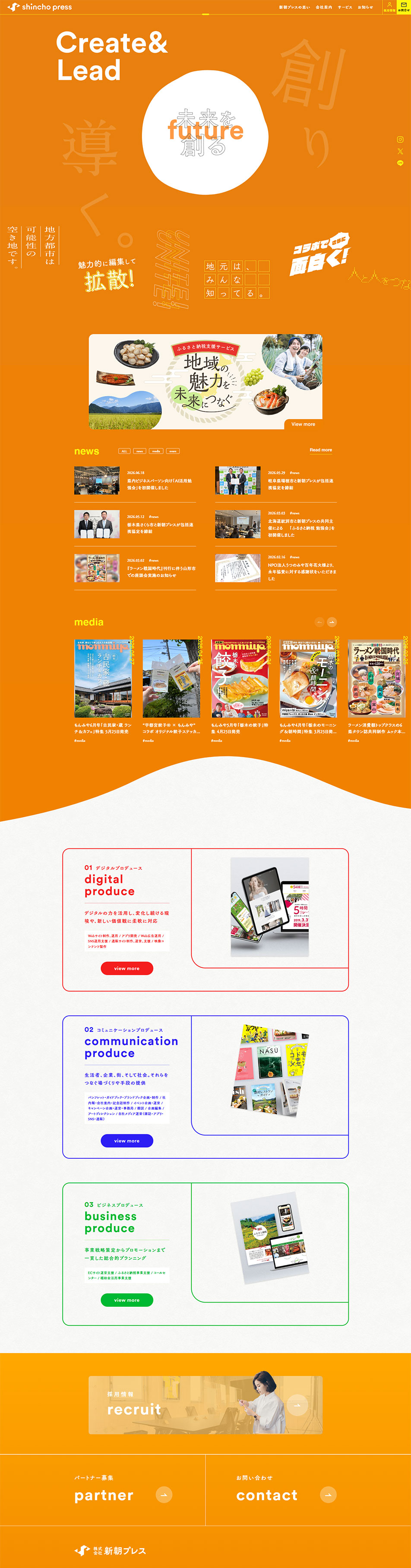
- This site is characterized by a design in which the color scheme shifts like a gradient from a vivid orange-based hero section to blue, green, and purple. As users scroll the page, the impression changes, expressing each service's personality through color while creating a pleasant rhythm across the entire site.
In the hero section, bold typography and graphics are combined to deliver strong impact and reinforce the company's creative brand image. Layouts that make use of whitespace and flexible text placement achieve both a sense of openness and a high level of design.
In the service introduction sections, accent colors such as red, blue, and green are used selectively for each section, allowing each piece of content to be expressed impressively while maintaining a coherent feel. Visuals such as photographs and magazine covers are also placed effectively, forming a composition that conveys the content's appeal intuitively.
Overall, through the use of color transitions and a refined layout, the design visually expresses the company's creativity and communicative strength, resulting in a design that combines individuality with cohesion.
【Note】 The landing page shown above was not designed by our company.
※You can view our production portfoliohere.
Clicking the design opens the source website.
*The original site may have been modified or removed.









