
LP design by Dispensing Pharmacy Aisei Yakkyoku
View PC page
View SP page

LP design by Dispensing Pharmacy Aisei YakkyokuLP information
- Registration date 2026-07-10
- https://www.aisei.co.jp/
- Product/service name
- Dispensing Pharmacy Aisei Yakkyoku
- Categories
- Businesses, companies, stores
- Company name
- Kabushiki Kaisha Aisei Yakkyoku(Chiyoda-ku, Tokyo-to)
- Color
- We design smartphone LPs using Green tones
- Image
- These smartphone LPs have a "Simple" style design
- Catchcopy
- A daily life where everyone can be healthy and smile.
- Design
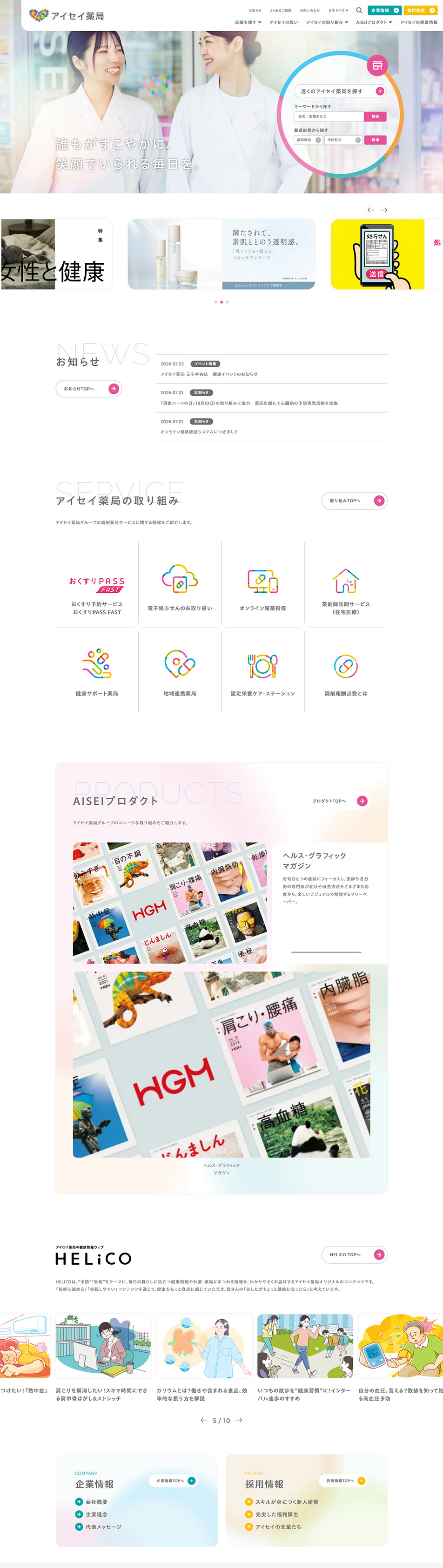
- This site features a design that balances cleanliness, approachability, and a sense of quality. A white-based, spacious layout combined with a rainbow gradient that evokes the brand color as an accent creates the reassurance and gentle impression required in the medical and healthcare fields.
In the hero section, a large portrait photo is placed to create familiarity through natural smiles and a bright atmosphere. Circular motifs and icons using gradients give the overall design unity and effectively reinforce the brand image.
Each section is organized in a card-style layout with ample whitespace, so even with a large amount of information the flow of the eye is easy to follow, giving a clean impression. The services introduction uses simple line-drawn icons and limits the number of colors while effectively using accent colors to balance legibility and design.
Also, by combining different visual elements such as photos, illustrations, and icons in a balanced way, the page avoids feeling monotonous. Card designs that utilize gradients and soft background colors convey a gentle, refined impression and express the trustworthiness and warmth characteristic of medical websites.
Overall, based on a refined minimal design, accents using the brand color and considered whitespace design achieve a high level of both readability and approachability. It is a highly polished corporate website design that unifies the company's brand worldview while visually conveying reassurance and cleanliness.
【Note】 The landing page shown above was not designed by our company.
※You can view our production portfoliohere.
Clicking the design opens the source website.
*The original site may have been modified or removed.









