
LP design by tottori bijinesu jinzai・kyujin shokai saito
View PC page
View SP page
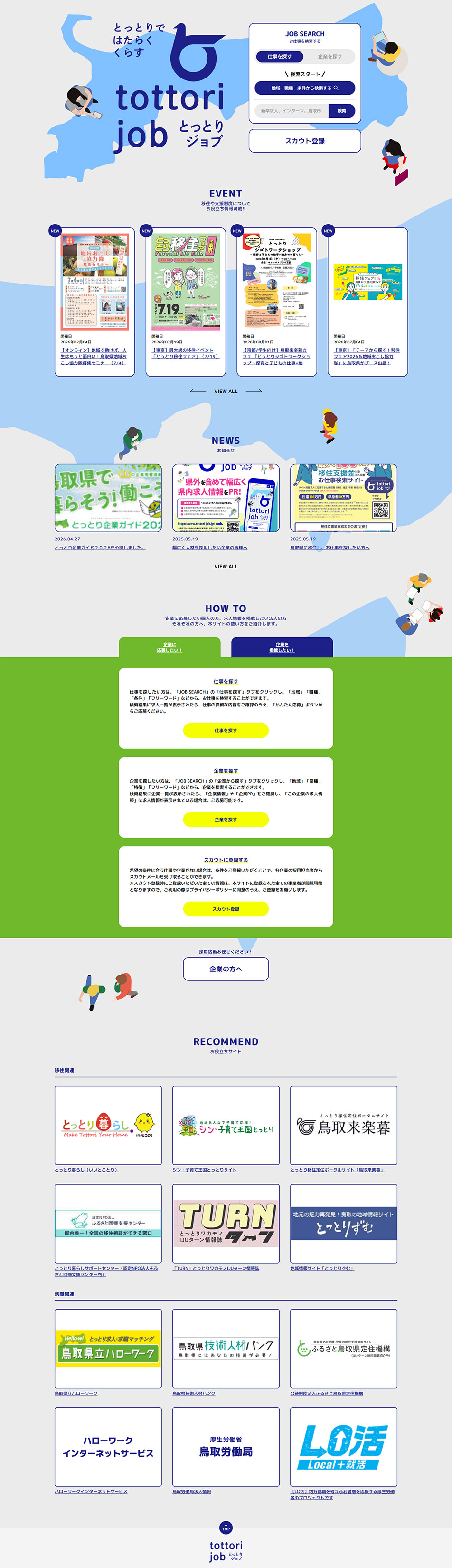

LP design by tottori bijinesu jinzai・kyujin shokai saitoLP information
- Registration date 2026-07-10
- https://www.tottori-job.jp/
- Product/service name
- tottori bijinesu jinzai・kyujin shokai saito
- Categories
- recruitment
- Company name
- Paasoru Bijinesu Purosesu Dezain Kabushiki Kaisha()
- Color
- We design LPs using Green tones
- Image
- These LPs have a "Simple" style design
- Catchcopy
- tottorijob tottori jobu
- Design
- By combining a simple layout with generous white space and illustrations inspired by Tottori-ken along with soft color tones, this website creates a regionally familiar and reassuring atmosphere. A blue-and-green color scheme expresses the area’s abundant natural character, and the person illustrations and map designs placed throughout visually communicate that the service connects job seekers with the region. The top page places the job search function in the first view, adopting a structure that allows smooth access to necessary information. Information such as events, news, and recommended sites is organized in a card-style layout so that it remains easy to read even when there is a large amount of content. Sections using color coding to indicate how to use the site, such as "Search for jobs" and "Search for companies," guide users clearly so that first-time users can operate without confusion. While maintaining the trustworthy feel of a public service, the gentle design that makes use of illustrations and white space avoids feeling stiff and results in an approachable impression as a community-based employment support site.
【Note】 The landing page shown above was not designed by our company.
※You can view our production portfoliohere.
Clicking the design opens the source website.
*The original site may have been modified or removed.








