LP design by Eraberu Sapurimento Shiriizu
View PC page
View SP page


LP design by Eraberu Sapurimento ShiriizuLP information
- Registration date 2026-07-09
- https://wellbeing.kirin.co.jp/imuse/lis/002_25/index.html
- Product/service name
- Eraberu Sapurimento Shiriizu
- Categories
- Health foods, health drinks, and supplements
- Company name
- Kirin Hoorudingusu Kabushiki Kaisha(Tokyo-to Nakano-ku)
- Color
- We design LPs using White-based
- Image
- These LPs have a "Trust and Safety" style design
- Catchcopy
- Protect your body from the inside with immune care, even during the scorching summer.
- Design
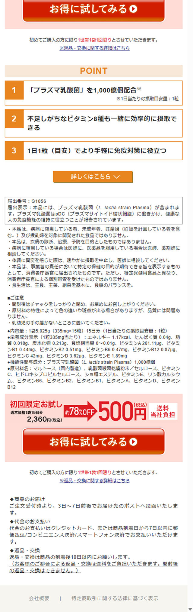
- This LP is a highly refined content-style LP design that carefully conveys the brand image supporting everyday health, not merely the functional aspect of 'immune care'.
A strong point is that it opens with a story that empathizes with consumers' concerns and lifestyles, then gradually presents research findings and the evidence as a food with functional claims, creating a structure that makes even specialized content easy to understand. In addition, the workings and research achievements of Purazuma Nyuusankin are conveyed clearly with diagrams and illustrations, making the reasons to choose it feel naturally convincing.
From a design standpoint, the clean white-based layout combined with blue accents creates a sense of trust and freshness. The use of whitespace and large visuals makes it easy to read even with a large amount of information, and there is a cohesive sense of the brand's overall world.
Overall, it is a highly complete content-style LP that balances scientific credibility with an approachable design, enhancing not only the product's appeal but also a sense of reassurance toward the brand.
【Note】 The landing page shown above was not designed by our company.
※You can view our production portfoliohere.
Clicking the design opens the source website.
*The original site may have been modified or removed.