
LP design by Hyakutooku | Mainabi for Teens
View PC page
View SP page

LP design by Hyakutooku | Mainabi for TeensLP information
- Registration date 2026-07-07
- https://job.mynavi.jp/careerdesign/cd3/
- Product/service name
- Hyakutooku | Mainabi for Teens
- Categories
- recruitment
- Company name
- Kabushiki Kaisha Mainabi(Chiyoda, Tokyo)
- Color
- We design LPs using Multi-color type
- Image
- These LPs have a "Stylish type" style design
- Catchcopy
- Hyakutooku
- Design
- 1. Worldview and tone & manner: creating a sense of looseness and emo-ness
Relaxed visuals
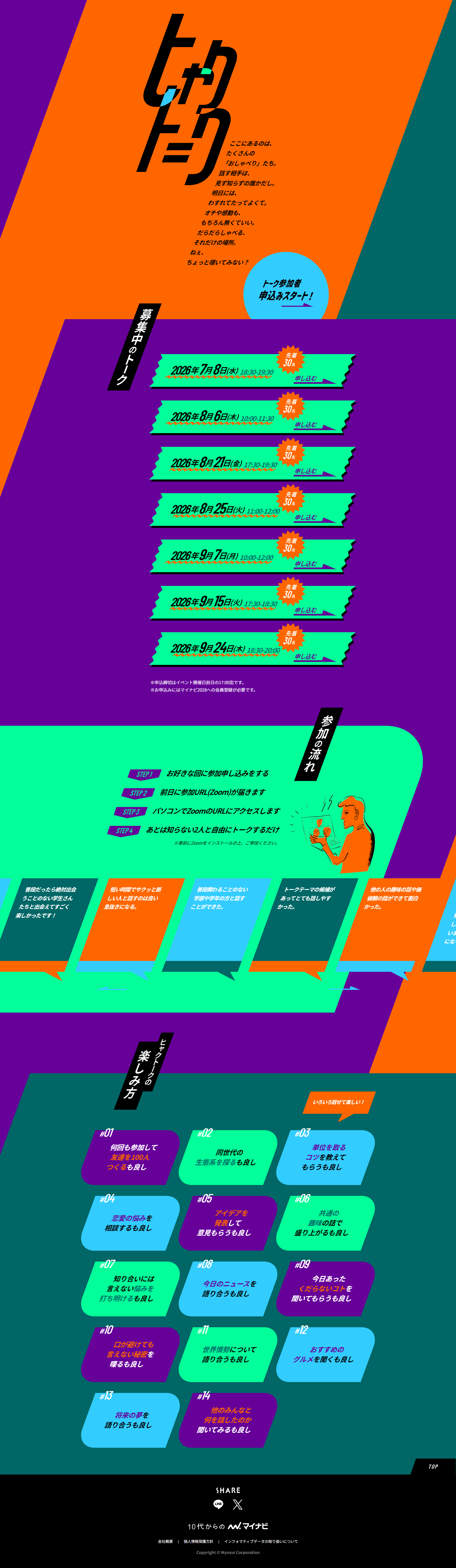
The site does not use the typical ‘‘students in suits with a fresh look’’ photos or ‘‘stiff business-style fonts’’ common on conventional job-hunting sites. As the catchphrases say, 'a place to chat casually, that's all.' and 'no punchline or moving moment required,' the design is crafted so that a laid-back worldview that minimizes psychological barriers pervades the entire design.
Gentle layout that makes good use of white space
Text written like poetry and a characteristic use of white space give the layout a refined yet unpretentious tone and manner, enabling younger users accustomed to SNS and smartphone browsing to feel a sense of emo-ness and comfort.
2. Text and visual design that captures the hearts of the target (Gen Z / teens)
Casual typography and SNS-style production
In the section on how to enjoy Hyakutooku, hashtag-style numbering such as #01 and #02 is used, creating a UI that young people familiar with social media can intuitively understand.
Fostering reassurance by foregrounding real voices
To ease the anxiety of 'talking to strangers,' many comments from past participants are published. These are not rigid reviews but down-to-earth remarks such as 'quickly chatting with new people is a nice break' and 'it's fine to have someone listen to silly things,' which further enhance the approachable impression of the design.
3. Smart information architecture (infographics and step diagrams)
A simple and easy-to-understand participation flow
From STEP1: application to STEP4: simply freely talking with two strangers, unnecessary explanations are omitted and the steps are presented using illustrations and simple icons (or diagrams). This is a UI/UX-faithful design that reduces the stress of taking action.
4. Branding that supports Mainabi's 'one step before'
The role of this landing page is not to make people start job hunting immediately, but to let them first experience the fun of connecting with peers beyond year and university. Therefore, the company's logo and the Mainabi brand are deliberately placed modestly, and the service name Hyakutooku's logo and concept are controlled to take center stage.
Overall, this is an excellent, target-first LP design that brilliantly overturns Mainabi's job-hunting image of being 'stiff,' 'serious,' and 'nerve-wracking,' and digitally expresses a clubroom-like vibe that makes people want to casually drop in.
【Note】 The landing page shown above was not designed by our company.
※You can view our production portfoliohere.
Clicking the design opens the source website.
*The original site may have been modified or removed.








