LP design by Sunoo Byuutii
View PC page
View SP page

LP design by Sunoo ByuutiiLP information
- Registration date 2026-06-29
- https://ohigroup.jp/index.html
- Product/service name
- Sunoo Byuutii
- Categories
- Cosmetics, makeup, and contact lenses
- Company name
- Shiseido Japan Kabushiki Kaisha(Tokyo-to Chuo-ku)
- Color
- We design LPs using Shades of blue
- Image
- These LPs have a "Refined style" style design
- Catchcopy
- Pre-birth Time Whitening Powder
- Design
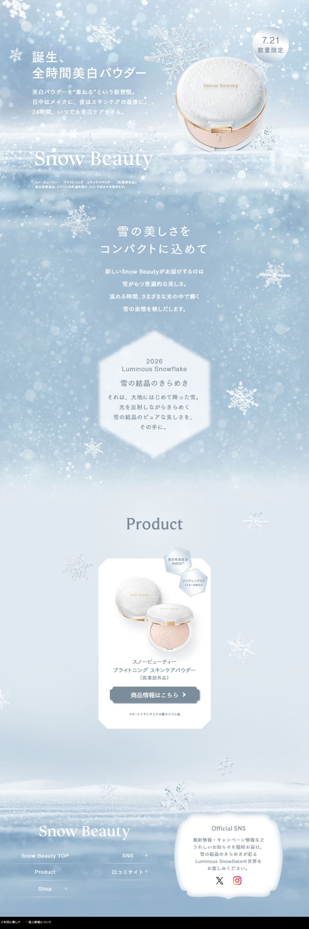
- Throughout the site, a snow-themed world is consistently expressed, creating a design that maximizes the brand's sophistication and translucency. The pale blue and white-based color scheme naturally ties into the product concept, giving the entire page a sense of cleanliness and a crisp atmosphere. The snowy landscapes, particles of light, and snowflake motifs spread across the background produce a dreamlike ambiance, giving the impression not only of the product's appeal but of experiencing the beauty the brand aspires to.
In the first view, the product is prominently placed and ample whitespace is used to evoke a sense of luxury. The background sparkle and soft gradients naturally draw the eye to the product, strongly conveying a feeling of exclusivity and specialness. Textual information is organized to the bare minimum, so the brand message is communicated without detracting from the visual beauty.
As you scroll, the brand concept unfolds at a relaxed rhythm. Wide spacing between sections allows each message to be read calmly. By incorporating hexagonal motifs and snowflakes as accents, the information pages—otherwise prone to monotony—gain variation while enhancing the design without disrupting the brand world.
The product introduction section is also very simple, structured to showcase product photos as the main focus. With decorations kept to a minimum and contrast against the background, the product stands out, creating a highly legible and refined impression. Buttons are colored in subdued tones that match the overall design, prioritizing elegance over flashiness.
The use of color is highly unified throughout. Using pale blue, white, and silver as a base and adding gold as an accent on the product naturally conveys not only cleanliness but also a sense of luxury. Also, background blurs and light effects create depth, preventing the design from appearing too flat and maintaining a soft impression. Even though there appear to be many decorations, the screen does not feel noisy thanks to the restrained palette and the balanced, translucent effects.
The overall page structure is also very simple and easy to understand, flowing naturally from the brand concept to product introductions and finally to brand information and social media. The layout avoids cramming in information and focuses on the brand experience, thereby enhancing not only the product's appeal but also likability and trust toward the brand itself. The scrolling creates a continuous effect like slowly moving through a snowy landscape, maintaining a unified world all the way to the end.
Overall, this landing page prioritizes carefully conveying the brand image and emotional value rather than aggressively promoting product features. The combination of beautiful visuals, layouts that make use of whitespace, a unified color scheme, and gentle information design results in a highly finished design that fully conveys the dignity and sense of exclusivity characteristic of a high-end cosmetics brand.
【Note】 The landing page shown above was not designed by our company.
※You can view our production portfoliohere.
Clicking the design opens the source website.
*The original site may have been modified or removed.