「in」ブランドシリーズ(自社サイト)
View PC page
View SP page
「in」ブランドシリーズ(自社サイト)LP information
- Registration date 2026-06-29
- https://www.morinaga.co.jp/in/main2026/
- Product/service name
- 「in」ブランドシリーズ
- Categories
- Health foods, health drinks, and supplements
- Company name
- 森永製菓株式会社(東京都港区)
- Color
- We design smartphone LPs using Shades of grey
- Image
- These smartphone LPs have a "Simple" style design
- Catchcopy
- in
- Design
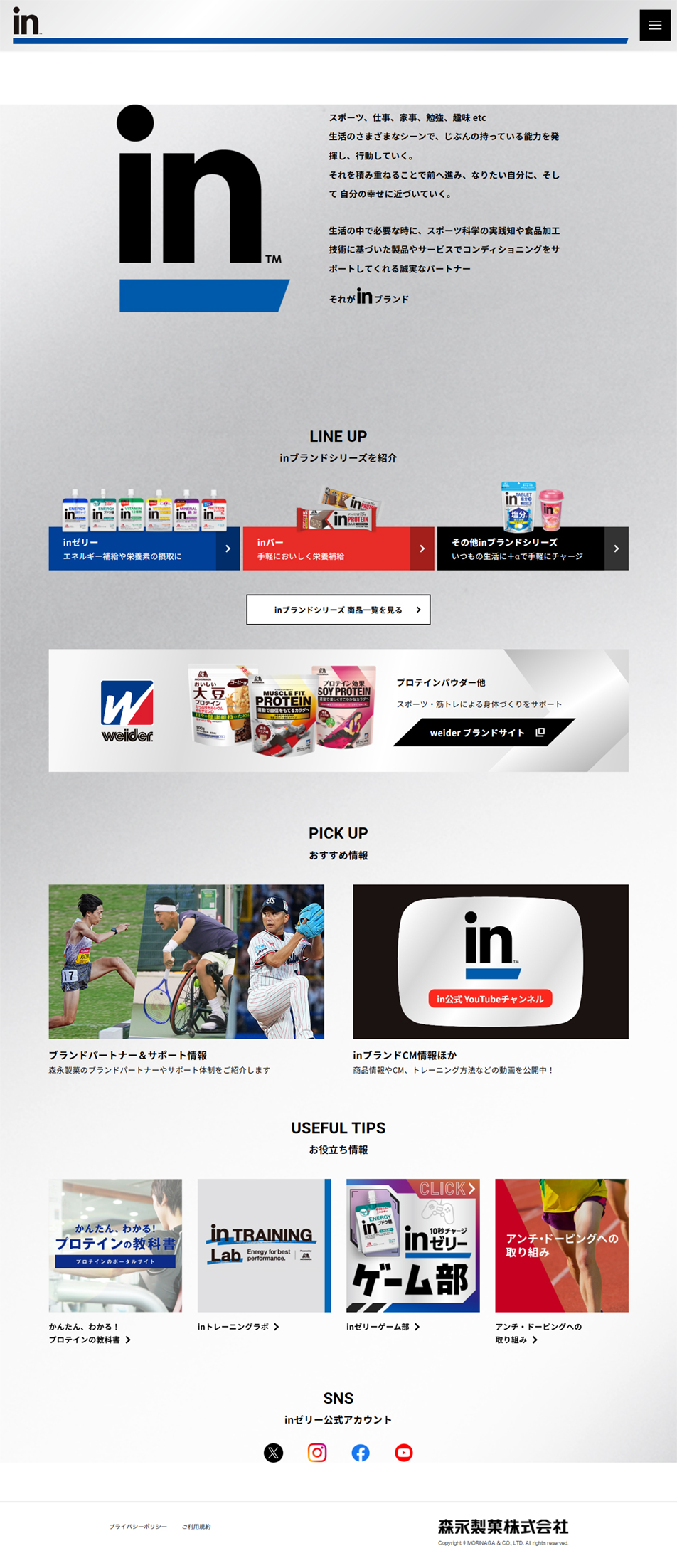
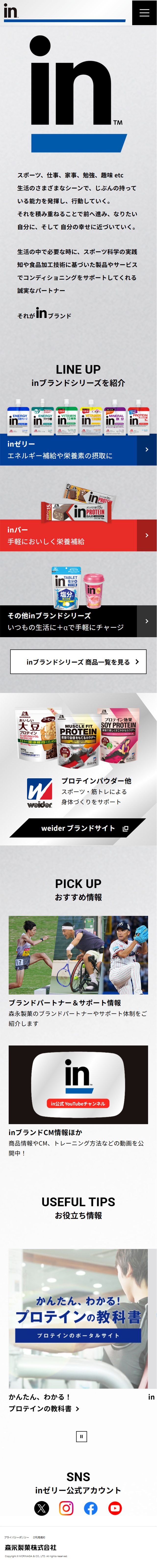
- 1. 高い信頼感と力強さ(ブランドイメージの訴求)モノトーンと青の配色: 白とグレーを基調に、ブランドカラーである深い「青(inブルー)」が効果的に使われています。これにより、スポーツや健康をサポートするブランドらしい「誠実さ」や「信頼感」が強く伝わってきます。大胆なロゴ配置: 画面最上部に大きく配置された「in」のロゴが非常に印象的です。一目でどのブランドのページかが分かり、力強いアイデンティティを感じさせます。2. 圧倒的な見やすさとスキャン性(情報の整理)明確なセクション分け: 「LINE UP」「PICK UP」「USEFUL TIPS」といった見出し(ヘッダー)が、十分な余白(ホワイトスペース)を持って配置されています。ユーザーがスクロールしながらでも、どこに何があるのか瞬時に把握しやすい構成です。商品カテゴリーの可視化: 「ゼリー」「バー」「その他」が色分けされたバナーで並んでおり、探している商品へ迷わずアクセスできるよう配慮されています。3. 多彩なメディアの統合(エンゲージメントの向上)親しみやすい画像選び: アスリートの躍動感ある写真や、YouTube、SNSのアイコン、親しみやすいイラスト(ゲーム部のアイキャッチなど)がバランスよく配置されています。単なる商品の紹介サイトに留まらず、ライフスタイルに寄り添うメディアとしての楽しさや親しみやすさが演出されています。全体の印象として、無駄な装飾を削ぎ落とした「シンプルで機能的な美しさ(ミニマリズム)」と、アクティブな生活を応援する「エネルギー」が同居した、非常に完成度の高いモダンなウェブデザインだと感じます。
【Note】 The landing page shown above was not designed by our company.
※You can view our production portfoliohere.
Clicking the design opens the source website.
*The original site may have been modified or removed.

