
LP design by in brand series
View PC page
View SP page

LP design by in brand seriesLP information
- Registration date 2026-06-29
- https://www.morinaga.co.jp/in/main2026/
- Product/service name
- in brand series
- Categories
- Health foods, health drinks, and supplements
- Company name
- Morinaga Seika Kabushiki-gaisha(Minato-ku, Tokyo)
- Color
- We design LPs using Shades of grey
- Image
- These LPs have a "Simple" style design
- Catchcopy
- in
- Design
- 1. High sense of trust and strength (brand image appeal)
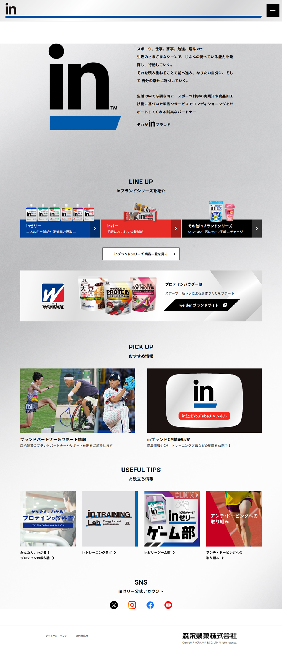
Monotone and blue color scheme: With white and gray as the base, the brand color, deep 'blue (in Buruu)', is used effectively. This strongly conveys the brand-like 'sincerity' and 'trustworthiness' that supports sports and health. Bold logo placement: The 'in' logo, placed large at the very top of the screen, is very striking. It instantly makes clear which brand the page belongs to and evokes a strong identity.
2. Exceptional readability and scannability (information organization)
Clear section division: Headings (headers) such as LINEUP, PICKUP, and USEFULTIPS are arranged with ample spacing (white space). This structure makes it easy for users to instantly grasp where things are even as they scroll. Product category visualization: Zerii, Baa, and Sonota are lined up as color-coded banners, allowing users to access the product they are looking for without hesitation.
3. Integration of diverse media (increased engagement)
Friendly image selection: Dynamic photos of athletes, YouTube and SNS icons, and approachable illustrations (such as game-bu eyecatch images) are well balanced. The site goes beyond merely introducing products and presents the fun and friendliness of a media outlet that aligns with users' lifestyles. Overall impression: It feels like a highly accomplished modern web design that combines 'simple, functional beauty (minimalism)'—stripping away unnecessary decoration—with the 'energy' that supports an active life.
【Note】 The landing page shown above was not designed by our company.
※You can view our production portfoliohere.
Clicking the design opens the source website.
*The original site may have been modified or removed.











