
LP design by Protein
View PC page
View SP page

LP design by ProteinLP information
- Registration date 2026-06-29
- https://www.morinaga.co.jp/protein/
- Product/service name
- Protein
- Categories
- Health foods, health drinks, and supplements
- Company name
- Morinaga Seika Kabushiki Kaisha(Tokyo-to Minato-ku)
- Color
- We design smartphone LPs using Shades of grey
- Image
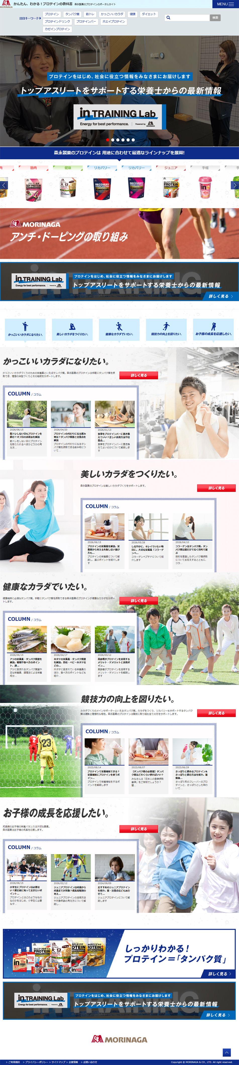
- These smartphone LPs have a "Trust and Safety" style design
- Catchcopy
- Latest information from nutritionists supporting top athletes
- Design
- 1. Colors that convey trust and clear whitespace
Fresh color scheme: A clean white base is accented with a vivid blue. It perfectly matches the clean image of sports, health, and protein. Adequate whitespace: Although the page is long vertically, appropriate spacing between sections prevents a cramped feeling even with a lot of text, giving a neat and easy-to-read impression. 2. A purpose-based structure that can be chosen intuitively
Large catchphrases that align with user motivations—such as "I want a cool body," "I want to build a beautiful body," and "I want to stay healthy"—are prominently placed. Photos tailored to target groups (men, women, seniors, juniors, etc.) are used effectively, so users can intuitively see which part to read. 3. Readability as media (columns)
Each section has a "COLUMN" box where thumbnail images and short texts are neatly arranged, making it easy to click through as if reading a blog or magazine. The red "Learn more" button functions as a visual cue (CTA), guiding the eye and removing hesitation about the next action. Overall, the design is very well balanced, transitioning like a gradient from a serious pro-athlete tone at the top to a more familiar, family-oriented tone toward the bottom.
【Note】 The landing page shown above was not designed by our company.
※You can view our production portfoliohere.
Clicking the design opens the source website.
*The original site may have been modified or removed.











