
LP design by in zerii budoutou
View PC page
View SP page

LP design by in zerii budoutouLP information
- Registration date 2026-06-25
- https://www.morinaga.co.jp/in/jelly/products/energy_budou/
- Product/service name
- in zerii budoutou
- Categories
- Health foods, health drinks, and supplements
- Company name
- Morinaga Seika Kabushiki Kaisha(Tokyo-to Minato-ku)
- Color
- We design LPs using White-based
- Image
- These LPs have a "Simple" style design
- Catchcopy
- For replenishing energy to think
- Design
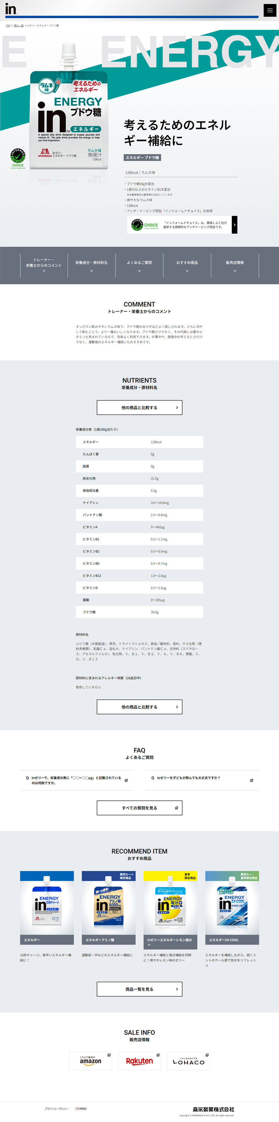
- Unified visibility and brand image — prominent 'in' logo: The brand's symbol 'in' is placed large and centered, allowing the product to be recognized as part of the series at a glance. Theme color green: A refreshing emerald green (green) is used on the top of the package and on text, clearly distinguishing it from the standard energy (blue) and the multivitamin (green · grapefruit). Intuitive flavor and function depiction — illustration placement: A familiar 'Morinaga Ramune' small-bottle illustration is drawn at the upper left, intuitively conveying that the flavor is ramune. Clear ingredient labeling: The word 'glucose' is arranged to stand out prominently so consumers can instantly understand what ingredient they will intake. Stylish and functional layout — clean white-based background: A white background that brings out the main green gives a sense of cleanliness and a smart impression. Balance of English and Japanese: The 'ENERGY' English wordmark and the Japanese product name are balanced in placement, creating a sporty yet practical design.
【Note】 The landing page shown above was not designed by our company.
※You can view our production portfoliohere.
Clicking the design opens the source website.
*The original site may have been modified or removed.











