LP design by inzerii
View PC page
View SP page

LP design by inzeriiLP information
- Registration date 2026-06-25
- https://www.morinaga.co.jp/in/jelly/sportslineup/
- Product/service name
- inzerii
- Categories
- Health foods, health drinks, and supplements
- Company name
- Morinaga Seika Kabushiki Gaisha(Tokyo-to Minato-ku)
- Color
- We design LPs using Shades of grey
- Image
- These LPs have a "Cool style" style design
- Catchcopy
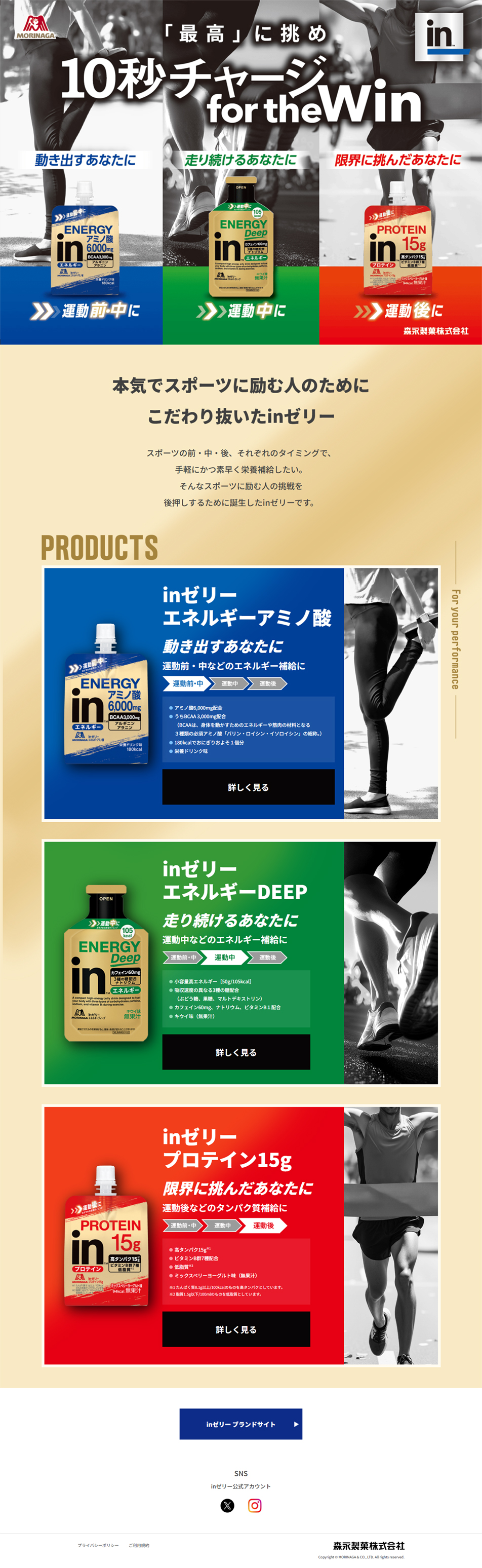
- 10-second charge for the win
- Design
- Clear color usage tailored to the target: an intuitive blue color scheme based on a refreshing blue that encourages "before/during exercise" actions and a blue that symbolizes the functionality of amino acids. High contrast: by combining white and yellow text against a blue background, high legibility is ensured even on small screens such as smartphones. A layout that guides the eye — left-to-right gaze movement: the product package is placed on the left, feature text in the center, and a photo that evokes an actual usage scene on the right, designed so users can naturally process the information. Visualization of usage scenes: combining a photo of a person stretching instantly conveys the intent of the tagline "for those who get moving." Smart information design: easily recognizable features via tags: keywords like "before/during exercise," "recommended," and "amino acids" are arranged as small tags (badges) so busy users can grasp the features in an instant. Organizing benefits with bullet points: specific ingredients and product benefits are summarized in concise bullets to reduce reading burden. Clear call to action (CTA): a "Learn more" button leading to detailed information is placed at the bottom on a black background, standing out as the section's conclusion.
inzeriisports lineupinzerii enerugii BCAAinzerii enerugii DEEPinzerii purotein15gmarathonfull marathonathleteMorinaga Seika
【Note】 The landing page shown above was not designed by our company.
※You can view our production portfoliohere.
Clicking the design opens the source website.
*The original site may have been modified or removed.