
LP design by inzerii Junia Enerugii
View PC page
View SP page

LP design by inzerii Junia EnerugiiLP information
- Registration date 2026-06-25
- https://www.morinaga.co.jp/in/jelly/jrenergy/
- Product/service name
- inzerii Junia Enerugii
- Categories
- Health foods, health drinks, and supplements
- Company name
- Morinaga Seika Kabushiki Kaisha(Tokyo-to Minato-ku)
- Color
- We design LPs using Shades of blue
- Image
- These LPs have a "Simple" style design
- Catchcopy
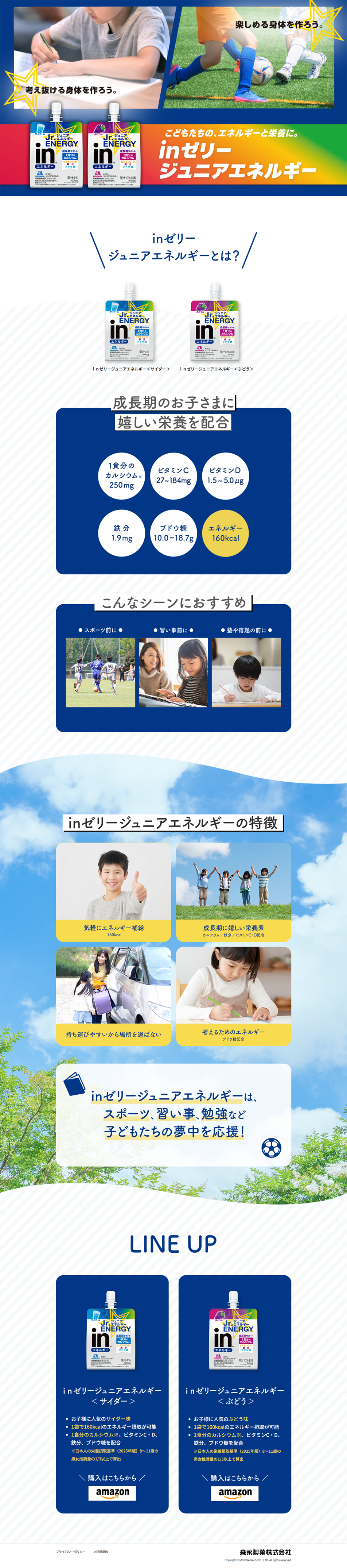
- Let's build a body that can enjoy. Let's build a body that can think things through.
- Design
- 1. Three-part everyday photos that convey the message intuitively: three photos capturing children's daily life (sports, time with family, studying) are placed side by side. Even without reading the text, the composition instantly communicates in what situations the product is consumed. 2. A simple layout that guides the viewer's gaze: using a rounded rectangle in dark navy (navy) as the base, with white text and photos placed on it. The strong contrast with the white background creates a visually striking accent that immediately catches the eye. 3. Simplified text and use of symbols: only short taglines such as 'After sports', 'Snack time', and 'Before cram school or studying' are included. The '◆' symbol is placed at both ends of each headline to give a sense of cohesion as a title.
【Note】 The landing page shown above was not designed by our company.
※You can view our production portfoliohere.
Clicking the design opens the source website.
*The original site may have been modified or removed.











