
LP design by Furugura
View PC page
View SP page
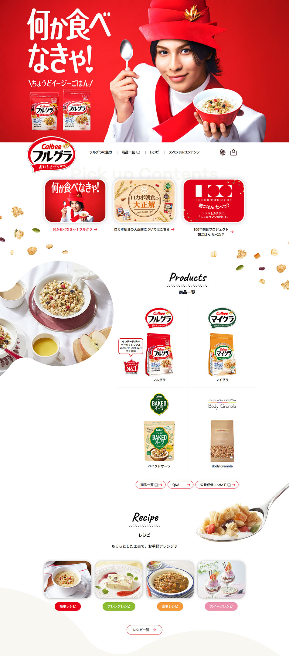

LP design by FuruguraLP information
- Registration date 2026-06-15
- https://www.calbee.co.jp/frugra/
- Product/service name
- Furugura
- Categories
- Health foods, health drinks, and supplements
- Company name
- Calbee(Tokyo-to Chiyoda-ku)
- Color
- We design LPs using Red tones
- Image
- These LPs have a "Simple" style design
- Catchcopy
- Gotta eat something!
- Site Description
- The product introductions, recipes, and pathways to other content are clearly organized, making it appealing that users can browse information enjoyably. The photographic presentation that highlights the ingredients of the cereal and fruits feels warm, naturally conveying the product's deliciousness and convenience. Overall, the site is highly polished, expressing a well-balanced sense of approachability and brand identity.
- Design
- Overall, the design impresses with a bright, friendly brand image; the red color scheme that symbolizes Furugura boosts product recognition while creating a lively atmosphere. The first view is impactful, and the characterful visuals attract users' interest.
【Note】 The landing page shown above was not designed by our company.
※You can view our production portfoliohere.
Clicking the design opens the source website.
*The original site may have been modified or removed.











