
LP design by Recruitment Information
View PC page
View SP page

LP design by Recruitment InformationLP information
- Registration date 2026-06-12
- https://www.nttdata-gsl.co.jp/recruit/
- Product/service name
- Recruitment Information
- Categories
- Graduate recruitment
- Company name
- Kabushiki Kaisha NTT Deeta Guroobaru Soryuushonzu(Tokyo-to Chuo-ku)
- Color
- We design LPs using Green tones
- Image
- These LPs have a "Simple" style design
- Catchcopy
- With GSL you can grow. With GSL you can achieve.
- Design
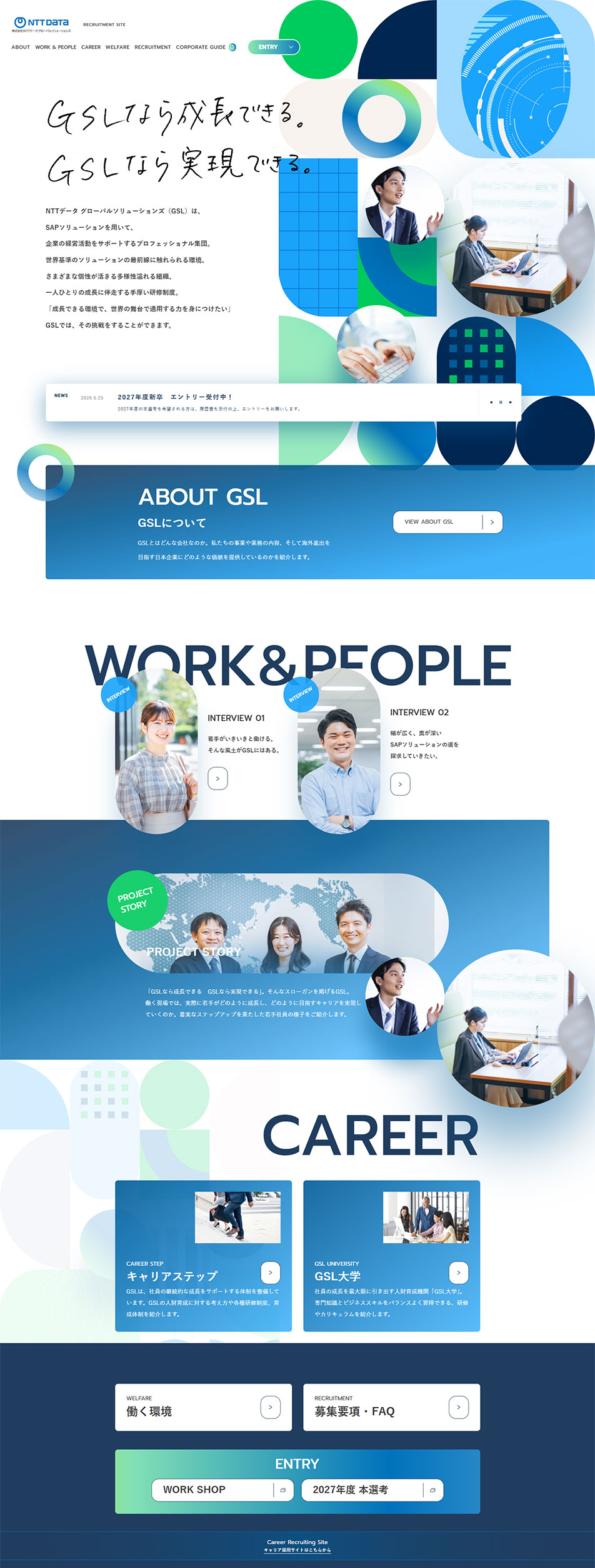
- The LP is produced as a new graduate recruitment site and is structured around the message "With GSL you can grow. With GSL you can achieve.", conveying the company's business domains and the appeal of career development. The overall design uses white as a base with the brand colors blue and green as accents, resulting in a refined design that evokes a sense of advancement and intelligence.
In the first view, a visual expression combining geometric shapes and photos of employees is a characteristic feature, effectively conveying the company's expertise in the IT and consulting domains and its forward-looking corporate image. A layout that makes use of white space organizes copy and information, creating a structure that naturally draws viewers into the content.
Within the page, through sections such as "ABOUTGSL", "WORK&PEOPLE", and "CAREER", a wide range of content is introduced, from company overview to employee interviews, project case studies, and career support systems. In particular, employee interviews and project stories prominently feature the people at work, making it easier to concretely imagine the corporate culture and working environment. In addition, content on career steps and educational systems is also substantial, clearly communicating efforts to support growth.
On the design side, repeated use of motifs such as circles, semicircles, and grids creates unity and builds a visual identity that evokes digital technology and data utilization. Gradients and translucent expressions are also effectively incorporated, forming an impression that balances solidity with advancement. While appropriately organizing the amount of information, it is a highly polished recruitment site design that visually and clearly conveys the company's appeal and growth environment.
【Note】 The landing page shown above was not designed by our company.
※You can view our production portfoliohere.
Clicking the design opens the source website.
*The original site may have been modified or removed.











