
LP design by KyaritasuUC
View PC page
View SP page

LP design by KyaritasuUCLP information
- Registration date 2026-06-12
- https://uc.career-tasu.jp/
- Product/service name
- KyaritasuUC
- Categories
- Design, Apps, Systems
- Company name
- Kabushikigaisha Kyaritasu(Bunkyo-ku, Tokyo-to)
- Color
- We design LPs using Green tones
- Image
- These LPs have a "Simple" style design
- Catchcopy
- The next-generation standard for recruitment information distribution that changes corporate hiring and transforms students' job-hunting.
- Design
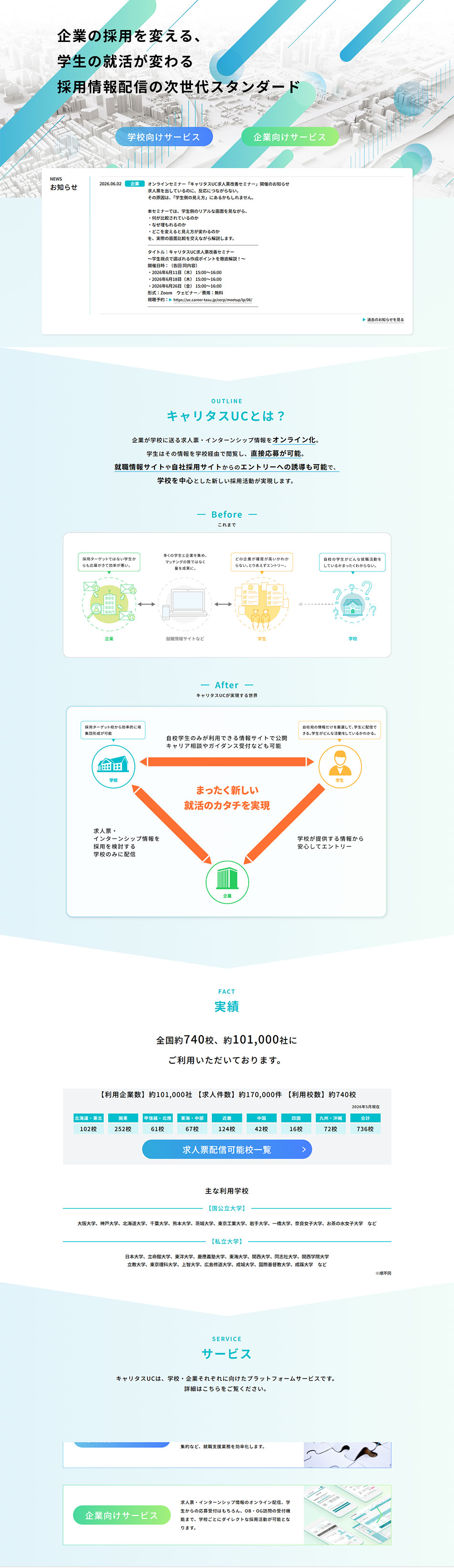
- This LP is composed to introduce the recruitment information distribution service "KyaritasuUC" that connects schools, students, and companies. A refreshing color scheme based on blue and green is used throughout, visually conveying the reliability and advanced nature that links educational institutions and companies.
In the first view, three-dimensional urban imagery and streamlined graphics are placed in the background, and by prominently presenting the message "Changing corporate hiring, transforming students' job-hunting," the service's innovativeness is emphasized. In the following content, beginning with the introduction titled "What is KyaritasuUC?", the differences between traditional job-hunting and the changes after adopting the service are explained clearly with diagrams, allowing the benefits for schools, students, and companies to be intuitively understood.
Also, the achievements section displays concrete figures such as the number of client companies and participating schools to effectively communicate the service's adoption status and credibility. By organizing information using charts and icons, a highly readable layout is achieved while presenting a large amount of information.
From a design perspective, ample whitespace is ensured while switching background colors for each section to clarify information separation. Furthermore, by actively incorporating illustrations and infographics, the specialized service content is conveyed in an approachable manner. Overall, it is presented as a corporate-style LP that carefully communicates the service's value by balancing trustworthiness, clarity, and innovation.
【Note】 The landing page shown above was not designed by our company.
※You can view our production portfoliohere.
Clicking the design opens the source website.
*The original site may have been modified or removed.











