
LP design by Gijutsu Honyaku
View PC page
LP design by Gijutsu HonyakuLP information
- Registration date 2026-06-12
- https://www.tratech.co.jp/
- Product/service name
- Gijutsu Honyaku
- Categories
- Businesses, companies, stores
- Company name
- Gijutsu Honyaku Kabushiki Kaisha(Tokyo-to Chuo-ku)
- Color
- We design LPs using Shades of blue
- Image
- These LPs have a "Simple" style design
- Catchcopy
- A company that treats Kotoba with care
- Design
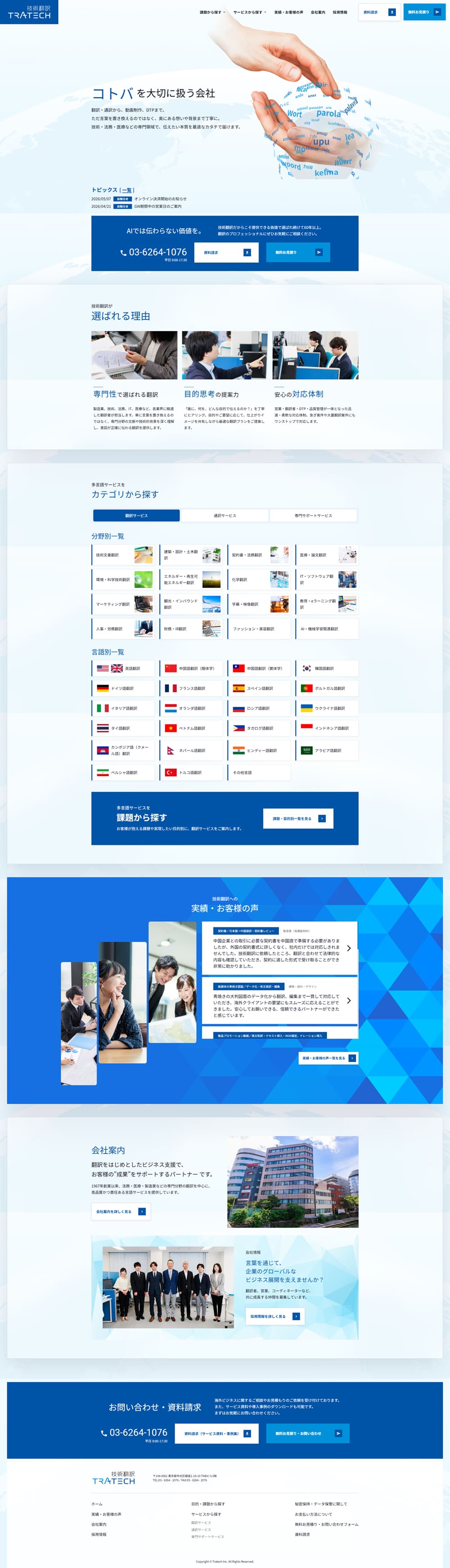
- As a whole, the design is that of a corporate website that emphasizes integrity and a sense of trust, and the blue-based color scheme effectively conveys professionalism and reassurance. In the first view, the company's philosophy and strengths are presented clearly, creating a structure that naturally communicates the reliability and track record of a translation company. Service introductions, supported languages, and case studies are organized and arranged, so even with a large amount of information it is easy to understand and allows smooth access to the information needed. Photographs and illustrations also have a unified feel, providing a friendly impression without undermining the company's solid image. Overall, it is a highly polished site in which the company's reliability and expertise are well balanced.
【Note】 The landing page shown above was not designed by our company.
※You can view our production portfoliohere.
Clicking the design opens the source website.
*The original site may have been modified or removed.











