
LP design by Raburandingu
View PC page
View SP page

LP design by RaburandinguLP information
- Registration date 2026-06-12
- https://www.choreo.co.jp/service/branding/
- Product/service name
- Raburandingu
- Categories
- Ad operations
- Company name
- Koreo Kabushikigaisha(Aichi-ken Nagoya-shi Higashi-ku)
- Color
- We design LPs using Shades of blue
- Image
- These LPs have a "Cute style" style design
- Catchcopy
- When it comes to branding, Koreo's 'Raburandingu' is recommended!
- Design
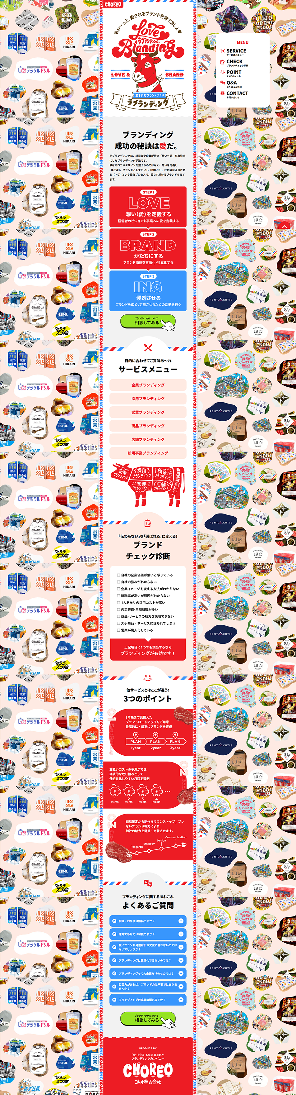
- This is a retro-pop, full-of-personality creative landing page designed to showcase a branding company's own brand strength. While presenting a large volume of achievements as a backdrop, it conveys the company's unique identity through strong typography and a distinctive worldview.
With a high-contrast color palette based on red, blue, and white, it simultaneously expresses passion, trust, and familiarity. The atmosphere evokes American diners and vintage advertising.
With an original brand worldview themed 'LOVE×BRAND', it uses cows, ribbons, and stamp-style graphics to create a playful touch.
【Note】 The landing page shown above was not designed by our company.
※You can view our production portfoliohere.
Clicking the design opens the source website.
*The original site may have been modified or removed.











