
LP design by Tokyu Kensetsu's Muzui-ino
View PC page
View SP page
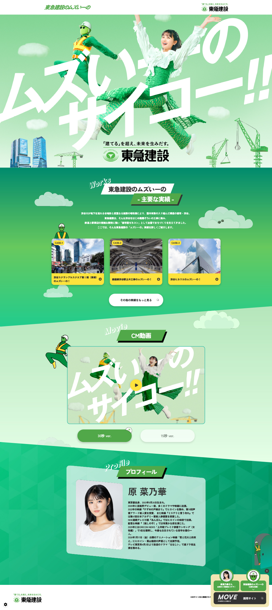

LP design by Tokyu Kensetsu's Muzui-inoLP information
- Registration date 2026-06-11
- https://www.tokyu-cnst.co.jp/muzuiino/
- Product/service name
- Tokyu Kensetsu's Muzui-ino
- Categories
- Businesses, companies, stores
- Company name
- Tokyu Kensetsu Kabushiki Kaisha(Tokyo-to Shibuya-ku)
- Color
- We design LPs using Green tones
- Image
- These LPs have a "Cute style" style design
- Catchcopy
- Muzui-ino is awesome!!
- Site Description
- Shibuyagawa flows underground within a valley topography, and repeated expansions and renovations of facilities have made Shibuya one of Japan's most intricate urban structures. Tokyu Kensetsu has taken on such challenging construction projects in Shibuya and elsewhere, and, as an "urban-type general contractor" strong in complex railway and station-area developments, has supported town development nationwide. Here, we introduce in detail Tokyu Kensetsu's "Muzui-ino" achievements.
- Design
- Using the brand color's vivid green as a base, and boldly arranging dynamic, oversized typography and the talent's sparkling smiles, it powerfully appeals to young people with a catchy, energetic world that overturns the staid image of the construction industry.
【Note】 The landing page shown above was not designed by our company.
※You can view our production portfoliohere.
Clicking the design opens the source website.
*The original site may have been modified or removed.











