
LP design by Design Production
View PC page
View SP page

LP design by Design ProductionLP information
- Registration date 2026-06-05
- https://lamauve.jp/
- Product/service name
- Design Production
- Categories
- Businesses, companies, stores
- Company name
- Kabushiki Kaisha LaMauve(Fukui-ken Sakai-shi)
- Color
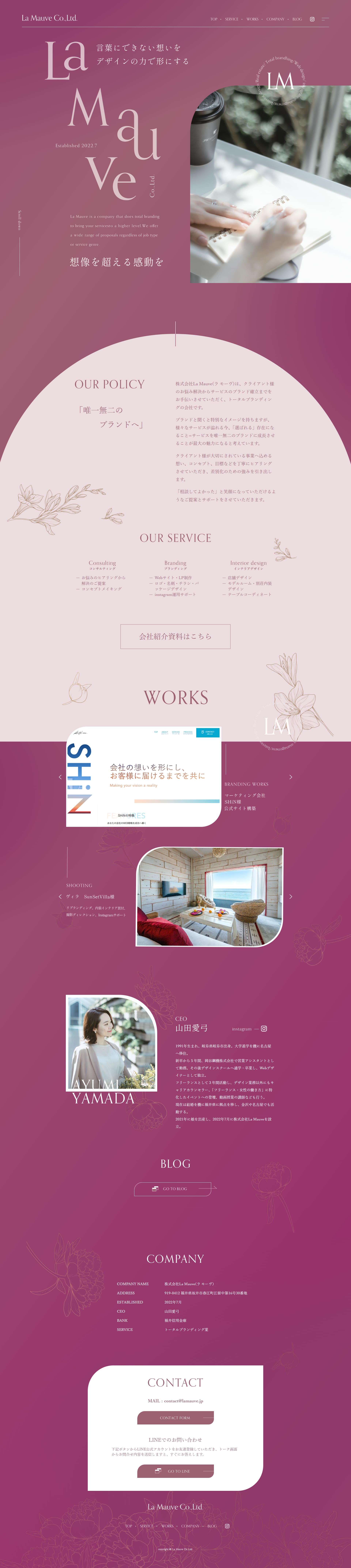
- We design LPs using Red tones
- Image
- These LPs have a "Simple" style design
- Catchcopy
- Shaping feelings that cannot be expressed in words through the power of design.
- Design
- This LP's major appeal is its sophisticated design that consistently expresses the brand's worldview. The elegant gradient that shifts from pink to purple and the delicate decorative illustrations evoke femininity and a sense of luxury, leaving a strong impression on visitors. In the hero section, the message "Shaping feelings that cannot be expressed in words through the power of design" is conveyed visually as well, allowing visitors to intuitively grasp the brand concept.
In addition, information such as "POLICY", "SERVICE", "WORKS", and "PROFILE" is organized and arranged, creating a structure that enables viewers to naturally deepen their understanding of the company. Presenting past work and the representative's profile also enhances credibility and familiarity. There is consistency in the use of photographs and white space, and because the amount of information is not excessive and it is easy to read, I felt this is a highly refined LP that achieves both branding and usability.
【Note】 The landing page shown above was not designed by our company.
※You can view our production portfoliohere.
Clicking the design opens the source website.
*The original site may have been modified or removed.











