
LP design by Kaki to Niku Tengoku Sapporo
View PC page
View SP page


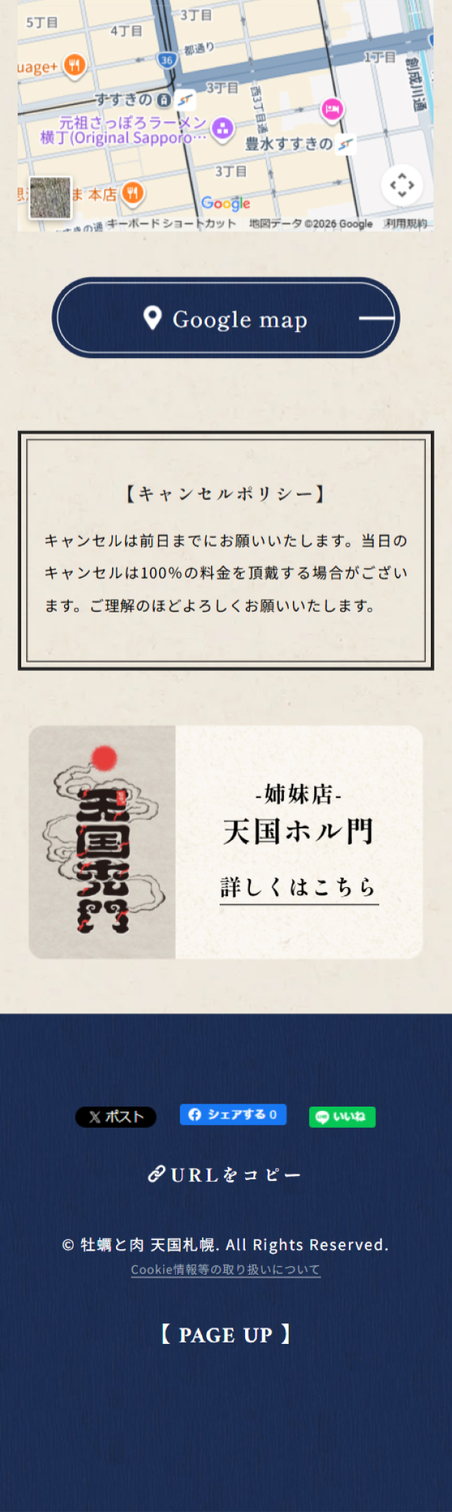
LP design by Kaki to Niku Tengoku SapporoLP information
- Registration date 2026-06-02
- https://www.paradise-sapporo.com/
- Product/service name
- Kaki to Niku Tengoku Sapporo
- Categories
- Businesses, companies, stores
- Company name
- Kaki to Niku Tengoku Sapporo(Hokkaido)
- Color
- We design LPs using Beige tones
- Image
- These LPs have a "Japanese style" style design
- Catchcopy
- This place is a heaven where both oysters and meat take center stage.
- Site Description
- Within walking distance from the Tanukikoji tram stop, the Nishi 4-chome tram stop, and Susukino Station. Located at Minami 3-jo Nishi 3-chome, Chuo-ku, Sapporo, Hokkaido, Kaki to Niku Tengoku Sapporo (kaki to niku tengoku sapporo) is a casual, popular izakaya known for oysters and meat.
- Design
- The refined wa-modern aesthetic is carefully expressed, presenting a sophisticated design that enhances the value of attractive ingredients such as oysters and meat. The layout makes effective use of whitespace and vertical typography to convey a sense of luxury and make the photographs more striking. The calm color palette based on navy and natural off-white provides a unified feel and effectively communicates the store’s upscale atmosphere. The composition flows naturally from dishes to the space to store information, resulting in a highly polished design that increases anticipation for visiting.
【Note】 The landing page shown above was not designed by our company.
※You can view our production portfoliohere.
Clicking the design opens the source website.
*The original site may have been modified or removed.











