
LP design by RMATCH
View PC page
View SP page
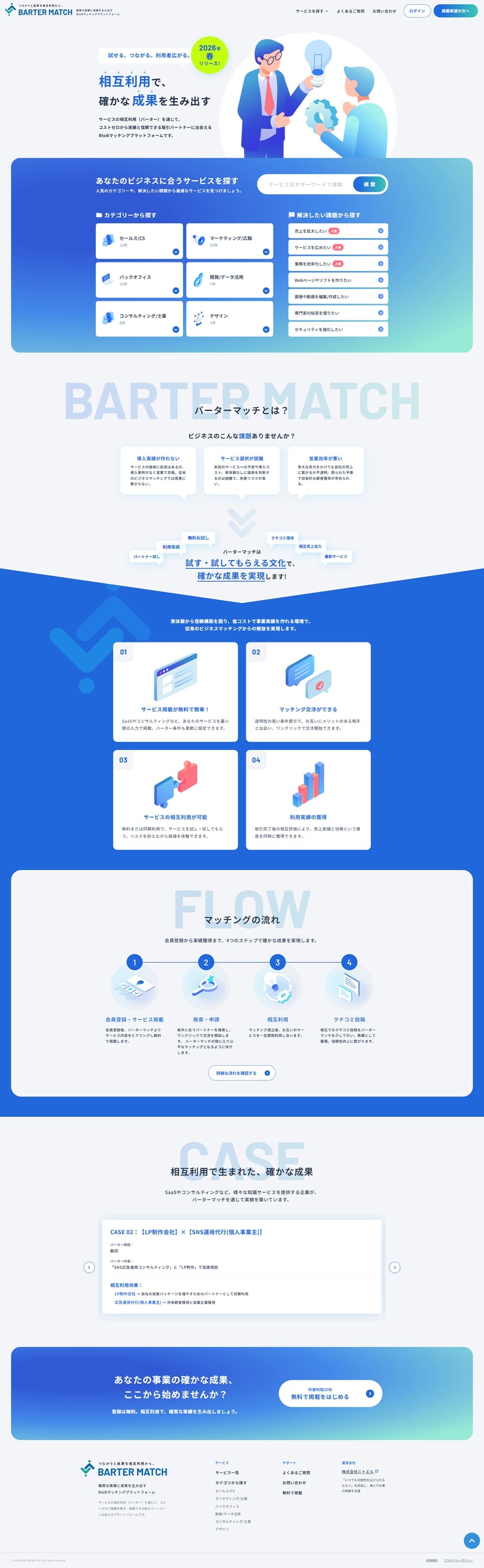

LP design by RMATCHLP information
- Registration date 2026-05-26
- https://barter-match.jp/
- Product/service name
- RMATCH
- Categories
- Businesses, companies, stores
- Company name
- Kabushikigaisha Nitoeru(Kanagawa-ken Yokohama-shi)
- Color
- We design LPs using Shades of blue
- Image
- These LPs have a "Simple" style design
- Catchcopy
- Generate reliable results through mutual use
- Design
- Overall, the landing page achieves both a very well-organized information architecture and the sense of trust characteristic of BtoB services. It is impressive how the mechanism of a matching service, which can easily become complicated, is made intuitively understandable through simple visuals and a clear structure. In particular, because the first section presents the service overview and the user flow simultaneously, the design makes it easy for users to grasp the content without confusion.
The color scheme centers on blue gradients, strongly expressing a sense of advancement, trust, and cleanliness. The contrast between the pale background and the vivid blue is well balanced, resulting in high overall legibility. Additionally, the soft tones used in the illustrations ease the stiffness typical of BtoB services and create a sense of approachability. Complementary greens and light-blue tones blend naturally, striking a good balance between a technological feel and reassurance.
In terms of structure, the classic flow of "problem presentation → service understanding → features → usage flow → achievements → CTA" is designed very carefully. In particular, the amount of information in each section is appropriately controlled, and the role of each screen is clear. As a result, even though the LP is relatively long, it does not tire the reader, and the gaze naturally moves to the next section. The frequent use of explanatory diagrams and card-style UIs also effectively aids visual understanding of complex content.
Across the whole site, the design communicates a balanced sense of "trust in the service" and "a concrete image after implementation," making this a very well-polished LP. Its strength is that it carefully conveys a "feeling of being safe to try," which is important in the BtoB field. While it is already highly refined, there appears to be room to further emphasize outcome visuals and implementation benefits to make the LP even more memorable.
【Note】 The landing page shown above was not designed by our company.
※You can view our production portfoliohere.
Clicking the design opens the source website.
*The original site may have been modified or removed.











