
LP design by Kurankii
View PC page
View SP page

LP design by KurankiiLP information
- Registration date 2026-05-15
- https://www.lotte.co.jp/products/brand/crunky/
- Product/service name
- Kurankii
- Categories
- chocolate
- Company name
- LOTTE(Tokyo-to Shinjuku-ku)
- Color
- We design LPs using Orange tones
- Image
- These LPs have a "Lively type" style design
- Catchcopy
- Choko Sakusaaaaaaku
- Site Description
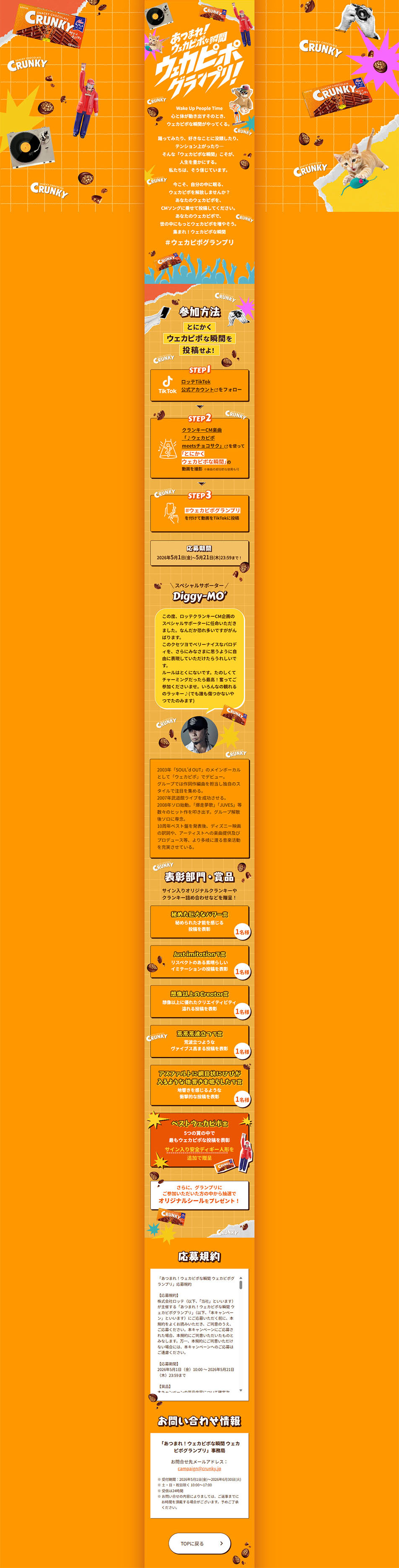
- Because the application procedures and prize information are organized in a step-by-step format, the information remains easy to understand even when there is a lot of it, creating a structure that allows users to participate without hesitation. The text decorations and frame design are also cohesive, further heightening the overall excitement of the campaign. Overall, this is a highly polished campaign landing page that successfully combines brand identity, entertainment value, and an inviting atmosphere that makes people want to participate.
- Design
- This landing page features a highly impactful design that emphasizes a poppy, energetic worldview. It is built around a vivid orange throughout, visually conveying the fun, momentum, and high energy characteristic of Kurankii. The abundant use of elements such as records, characters, and bursting motifs is attractive in how it effectively expresses affinity with music and culture.
【Note】 The landing page shown above was not designed by our company.
※You can view our production portfoliohere.
Clicking the design opens the source website.
*The original site may have been modified or removed.











