
LP design by sopota sofuto sheru herumetto
View PC page
View SP page

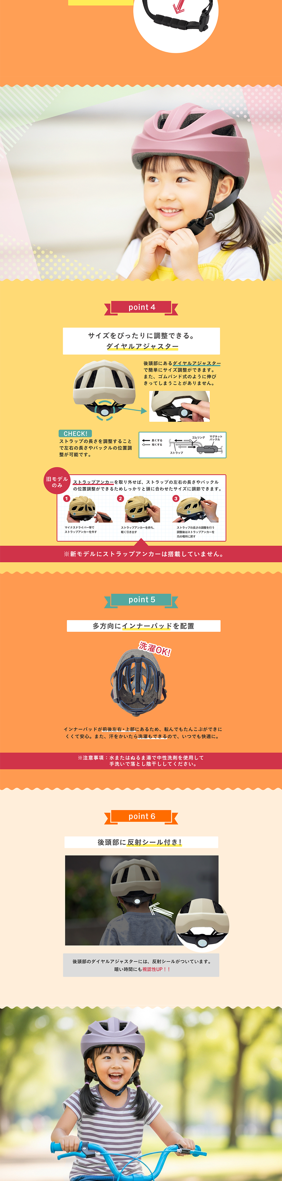


LP design by sopota sofuto sheru herumettoLP information
- Registration date 2026-04-28
- https://item.rakuten.co.jp/samuriding/sop-ch/
- Product/service name
- sopota sofuto sheru herumetto
- Categories
- Kids & Baby Products
- Company name
- samurai-dingu kabushikigaisha(〒409-3867 yamanashi-ken nakakoma-gun showa-cho shimizu arai 279)
- Color
- We design LPs using Multi-color type
- Image
- These LPs have a "Cute style" style design
- Catchcopy
- Let even little children say "I want to wear it myself!". A helmet parents and children can both wear! A reassuring helmet
- Design
- 1. Visually easy-to-understand layout
Many illustrations and diagrams make the features and usage of a children’s product intuitive to understand. The design allows you to grasp the overview without reading the text.
2. Clear benefit appeal
Benefits such as "safety", "fun", and "effects on growth" are organized so the reasons to buy are clear at a glance. It also considers alleviating parents' concerns.
3. A storyline flow
The flow—problem identification → solution → product introduction → track record/trust → purchase path—is natural, making it easy to keep reading to the end.
4. Strong credibility assurance
There are reviews, track records, comparison tables, etc., and the specific "reasons it is chosen" are shown, which provides a sense of security.
5. Clear target
Design and copy are clearly aimed at children and caregivers, so there is no ambiguity about who the product is for.
6. Easy-to-follow purchase path
CTAs are placed in appropriate positions, allowing a smooth transition to purchase at the moment of interest.
7. Clear information emphasis
Through accent colors and section separation, important points don't get buried and readability is maintained.
Overall, it is a highly complete landing page that achieves both "ease of understanding" and a "sense of security".
【Note】 The landing page shown above was not designed by our company.
※You can view our production portfoliohere.
Clicking the design opens the source website.
*The original site may have been modified or removed.











